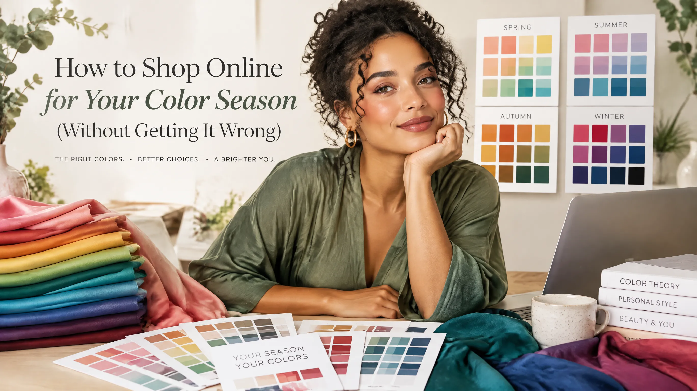
How to Shop Online for Your Color Season (Without Getting It Wrong)
The Online Shopping Color Problem Nobody Talks About
I was so excited when I finally figured out my color season. Soft Summer — muted, cool-toned, medium-depth colors. Dusty rose, sage, slate blue, cool taupe. I immediately opened my laptop, pulled up my favorite stores, and started adding things to my cart.
Three days and one delivery later, I was staring at a pile of clothes that looked nothing like what I'd ordered. The "dusty mauve" top was aggressively pink. The "sage green" trousers were neon olive. And the "cool gray" blazer had a distinctly warm, yellowish cast that made me look like I hadn't slept in a week.
Sound familiar? If you've ever tried to shop online for your color season, you know the pain. The colors on your screen are not the colors on the hanger — and knowing your season doesn't help if every monitor lies to you differently.
I've spent two years refining a system for online color shopping that actually works. Here's everything I've learned about buying the right colors without touching the fabric first.
Why Online Colors Are So Unreliable
Before we fix the problem, it helps to understand why online colors are wrong so often. It's not just bad photography — there are at least five layers of distortion between the real garment and what you see on screen.
1. Product Photography Lighting
Most e-commerce studios use a combination of strobe lights and softboxes. The color temperature of these lights varies from studio to studio and even shot to shot. A garment photographed under 4000K tungsten-balanced light will look warmer than the same item shot under 6500K daylight-balanced strobes.
Fast-fashion brands are the worst offenders here. They photograph hundreds of items per day with minimal color correction, so the same "navy" can look royal blue in one listing and almost black in another.
2. Monitor Calibration
Your screen has its own color profile. An iPhone on True Tone in a warm room shifts everything warm. A MacBook on Night Shift adds amber. A cheap office monitor might crush blues and boost reds. Two people looking at the same product page will see meaningfully different colors.
3. Image Compression
JPEG compression — the format used by virtually every online store — sacrifices subtle color gradations to reduce file size. This hits muted colors hardest. A Soft Autumn olive and a Soft Summer sage might be distinguishable in person but look identical after compression.
4. Background Interference
The color of the background, the model's skin tone, and even the styling of the photo affect your perception. A dusty rose blouse on a warm-toned model against a beige backdrop looks warmer than the exact same blouse on a cool-toned model against white. Your brain adjusts color perception based on surrounding context — a well-documented phenomenon called simultaneous contrast.
5. Name-Color Mismatch
Fashion brands name colors for marketing, not accuracy. "Dusty Rose" at Zara, H&M, and Nordstrom are three completely different shades. "Sage" ranges from true sage (cool, muted green) to what should honestly be called "lime." You cannot trust color names alone.
See your personal color palette now
Upload a photo — get your AI beauty report in 60 seconds.
The 7-Step System for Shopping Your Palette Online
Here's the practical framework I use every time I shop online. It doesn't require special equipment — just a few habits that dramatically reduce the return pile.
Step 1: Build a Physical Color Reference
This is the single most impactful thing you can do. Get a physical set of your season's colors — fabric swatches, paint chips from a hardware store, or printed color cards — and keep them near your computer.
When you find something you like online, hold your physical swatch next to the screen. You're not comparing screen-to-swatch directly (that's impossible with different light sources). Instead, you're checking whether the on-screen color falls within the same family as your palette. If the "dusty mauve" on screen looks significantly warmer or brighter than any swatch in your Soft Summer set, it's a warning sign.
Where to get swatches:
- Hardware store paint chips — free and surprisingly useful. Grab chips from the muted, medium-depth range of your season's colors
- Fabric stores — buy small cuts of fabric in your key palette colors (under $5 total)
- Printed palette cards — several color analysis professionals sell printed cards with accurate Pantone-referenced colors
Step 2: Check Multiple Product Images
Never rely on the hero image alone. Click through every available photo:
- Flat lay shots (garment on white background) are usually the most color-accurate because they're shot under controlled lighting without a model's skin tone influencing perception
- Detail/close-up shots show fabric texture and how the color behaves in folds and shadows
- Model shots show how the color interacts with skin, but remember the model's undertone affects your perception
- Customer review photos are gold. Real people, real lighting, unedited colors. These are often the most accurate representation of the actual garment
Step 3: Read the Fabric Composition
Fabric type changes how color appears — and this information is always listed online.
- Cotton absorbs dye evenly and tends to show colors accurately. What you see is roughly what you get.
- Polyester/synthetic reflects light differently, often making colors appear slightly brighter and more saturated than they are in natural light
- Silk has a natural sheen that adds warmth to any color. A "cool gray" silk will look warmer than the same gray in cotton.
- Wool absorbs light, making colors appear deeper and more muted than photographed
- Linen has a natural warmth and texture that shifts colors slightly toward the warm side
If you're a cool season (Summer or Winter), be cautious with silk and linen — they naturally warm colors up. If you're a warm season (Spring or Autumn), polyester's artificial brightness might push muted colors outside your range.
Step 4: Use the Brand's Size/Color Review Filter
Most major retailers now let you filter reviews by color purchased. This is incredibly valuable:
- Search for reviews mentioning "color" or "shade" — shoppers frequently comment on color accuracy
- Look for phrases like "more purple in person" or "runs warmer than pictured" — this is free, crowd-sourced color correction
- Pay attention to reviewers who mention their own coloring ("as a warm-toned person, this looked...") — their experience may predict yours
Step 5: Cross-Reference Across Retailers
Many brands sell through multiple retailers, and each retailer photographs products independently. Search for the exact same item on the brand's own site, a department store, and a marketplace. If the color looks consistent across all three, you can be more confident it's accurate. If it varies wildly, the actual color is probably somewhere in the middle.
Step 6: Apply the "Worst Case" Test
Before clicking buy, ask yourself: "If this color is one shade warmer / cooler / brighter / more muted than it looks on screen, would it still work for my season?"
This is where understanding your season's boundaries matters. Some seasons are more forgiving:
- Soft seasons (Soft Summer, Soft Autumn) — the key quality is mutedness. As long as a color isn't too bright or saturated, you have flexibility on temperature
- True/Pure seasons (True Spring, True Summer, True Autumn, True Winter) — temperature is critical but you have flexibility on depth and chroma
- Bright seasons (Bright Spring, Bright Winter) — saturation is your friend. Err toward brighter rather than more muted
- Light seasons (Light Spring, Light Summer) — depth is the key constraint. Avoid anything too dark, even if the undertone is right
- Deep seasons (Deep Autumn, Deep Winter) — opposite rule. Avoid pastels, even in your temperature range
Step 7: Master the Return Window
Even with perfect technique, online color shopping has a failure rate. Build returns into your strategy:
- Only buy from stores with free returns for color-sensitive purchases
- Order two shades when available — the warm and cool version, or the light and dark — and return the wrong one. The cost of a return is always less than the cost of a garment you never wear
- Try on near a window in natural daylight. Never evaluate colors under bathroom lighting or at night. Daylight between 10 AM and 2 PM is the most color-neutral
- Hold a white sheet of paper next to the garment against your face — this neutral reference helps your eye detect whether the garment's undertone is warm or cool
The Digital Color Matching Cheat Sheet
Here's a quick-reference table for common online color names and what they actually tend to mean for each season type:
| Online Color Name | Usually Suits | Often Disappoints |
|---|---|---|
| "Dusty Rose" | Soft Summer, Light Summer | Deep seasons (too pale) |
| "Burgundy" | Deep Autumn, Deep Winter | Light seasons (too dark) |
| "Sage" | Soft Autumn, Soft Summer (if truly muted) | Bright seasons (too dull) |
| "Navy" | Almost everyone | Rarely disappointing — check for green-navy vs blue-navy |
| "Cream" | Warm seasons (Spring, Autumn) | Cool seasons (the yellow base clashes) |
| "Ivory" | Most seasons | Deep Autumn (not enough contrast) |
| "Blush" | Light Spring, Light Summer | Deep seasons (too washed out) |
| "Olive" | Warm seasons, Soft Autumn | Cool-dominant seasons |
| "Charcoal" | Cool seasons, Deep seasons | Light Spring (too heavy) |
| "Terracotta" | Warm Autumn, Deep Autumn | Cool Summer, Cool Winter |
When Technology Actually Helps
Here's where things get interesting. Traditional color matching required you to become a human colorimeter — training your eye to detect undertones through screens, fabric, and lighting distortions. That's a real skill, but it takes time to develop.
Modern AI color analysis tools can shortcut this process. Instead of guessing whether a "dusty mauve" will work for your Soft Summer palette, you can use tools that analyze the actual color values and compare them against your season's characteristics.
For example, aicoloranalysis.io offers outfit color analysis that evaluates whether specific clothing colors harmonize with your skin tone. You upload a photo wearing the item, and it tells you whether the color is enhancing or clashing with your natural coloring. It's essentially the "draping test" you'd do in a stylist's office, but accessible from your living room.
This doesn't replace learning to read colors yourself — but it's a useful verification tool, especially when you're developing your eye.
Three Brands That Get Online Color Right (And How to Spot Others)
Through years of online shopping, I've noticed that some brands are consistently better at accurate color representation. Here's what they do differently:
What accurate brands do:
- Photograph on plain white or light gray backgrounds with calibrated lighting
- Show the garment on models with diverse skin tones
- Include color accuracy disclaimers and detailed color descriptions ("cool-toned dusty pink with gray undertones")
- Provide fabric-only close-ups without styling or filters
- List the exact Pantone or similar reference for each color
Red flags for inaccurate color:
- Heavy Instagram-style filters on product photos
- Only one product image per color
- Color names that are vague or purely aspirational ("Midnight Dream," "Autumn Whisper")
- No customer photos or reviews
- Extremely bright or oversaturated product photography
Key Takeaways
- Online colors are distorted by lighting, monitor calibration, compression, backgrounds, and creative color naming — expect 20-30% color variation from screen to reality
- Physical color swatches near your screen are the single best investment for online shopping accuracy
- Customer review photos are more reliable than professional product shots for judging true color
- Fabric composition changes color appearance — cotton is most reliable, silk adds warmth, polyester adds brightness
- Understand your season's boundaries (what quality matters most) to evaluate "worst case" scenarios before buying
- Free returns are a color-shopping strategy, not a convenience — order strategically and return without guilt
The best online shoppers I know don't have perfect color vision. They have systems. Build yours, and you'll stop dreading the moment a delivery box arrives.
Related Articles
- How to Build a Capsule Wardrobe for Your Color Season — Build a versatile wardrobe within your palette
- Best Colors for Warm Undertones: Your Complete Style Guide — Color recommendations for warm-toned shoppers
- Soft Autumn vs Soft Summer: The Most Commonly Confused Color Seasons — Tell these similar seasons apart
- Color Analysis: The Complete Guide — Everything you need to know about finding your best colors
Want to try AI color analysis yourself?
Upload one photo and get a magazine-level beauty report in 60 seconds.
Start Free AnalysisRelated Posts
I Wore Only My 'Season Colors' for 30 Days — Here's What Happened
A personal experiment in dressing exclusively in my color season palette for a full month. The compliments, the surprises, and the unexpected lessons about personal style.
How to Transition Your Color Palette From Spring to Summer (Without Starting Over)
Struggling to adapt your wardrobe when the weather shifts? Here's a practical guide to transitioning your color palette from warm Spring tones to cool Summer hues — using what you already own.
Which Celebrity Has Your Color Season? Find Your Style Twin
Discover which celebrities share your color season — from Taylor Swift's Light Summer to Lupita Nyong'o's Deep Winter. Learn how to study your style twin's fashion choices and apply their looks to your own wardrobe.
How to Build a Capsule Wardrobe for Your Color Season (Step-by-Step)
Learn how to create a versatile capsule wardrobe based on your color season. From choosing neutrals to accent pieces, this guide turns color analysis into a practical shopping strategy.