How to Transition Your Color Palette From Spring to Summer (Without Starting Over)
The Closet Crisis That Happens Every June
Every year around late May, I hit the same wall. My closet is full of the warm peach, coral, and golden yellow pieces that made me glow all spring — but suddenly they feel too heavy, too warm, too much. The light has changed. The air feels different. And the colors that made me radiant in April now make me look slightly flushed by June.
If you've ever felt like your wardrobe just stops working when the weather shifts, you're not imagining it. The transition from spring to summer isn't just a temperature change — it's a light change. And that shift in natural light genuinely affects how colors interact with your skin.
This isn't about throwing out your spring wardrobe and buying a new one. It's about understanding the overlap between Spring and Summer palettes, identifying your bridge pieces, and making strategic small additions that carry you through the shift.
Why Seasonal Light Changes How Colors Look on You
Here's something most color analysis guides skip: your color season doesn't change with the calendar. A True Spring is a True Spring in January and in August. But the ambient light around you absolutely shifts — and that changes how your palette colors render against your skin in real life.
Spring sunlight is lower-angle, warmer in color temperature, and softer. It flatters warm, clear tones naturally. Summer sunlight is higher-angle, cooler, and more diffused (especially in humid climates). Colors that popped in spring's golden light can look slightly garish under summer's cooler, brighter sky.
This is why many people intuitively reach for softer, cooler pieces in summer even if their color season is technically warm. They're compensating for the light shift — and that's actually smart styling, not a color analysis violation.
The trick is doing it intentionally rather than by frustrated trial-and-error.
See your personal color palette now
Upload a photo — get your AI beauty report in 60 seconds.
The Spring-Summer Overlap Zone: Colors That Work in Both
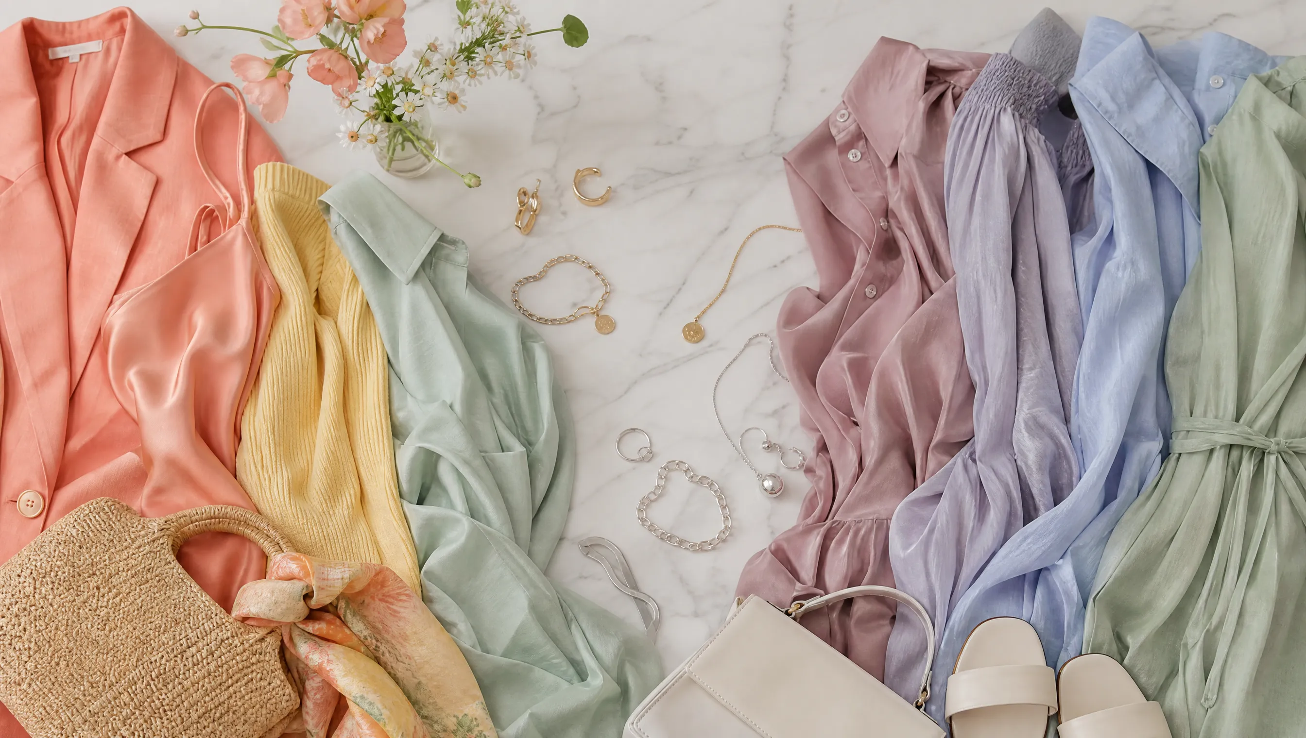
The good news: Spring and Summer palettes aren't opposites. They share a surprising number of colors in the middle ground — especially if you focus on the bridge sub-seasons: Light Spring and Light Summer.
Colors that work across both seasons:
- Soft coral → warm enough for Spring, muted enough for Summer
- Dusty rose → the cooled-down version of Spring's peach
- Warm lavender → Summer's signature, but the warmer versions still harmonize with Spring skin
- Sage green → sits right between Spring's warm greens and Summer's cool teals
- Champagne / soft gold → works as a neutral for warm and cool-leaning palettes alike
- Powder blue → Light Spring's secondary blue overlaps with Summer's core palette
- Soft aqua → the sweet spot between Spring's turquoise and Summer's seafoam
These are your bridge colors — the pieces that earn their closet space by working across the transition without looking out of place in either season's light.
A Practical Transition Strategy (Week by Week)
You don't need to overhaul your wardrobe on June 1st. Here's how I handle the shift:
Weeks 1–2: Start Muting
Keep your Spring palette but start choosing the muted versions of your usual colors. Swap bright coral for soft coral. Trade clear turquoise for dusty aqua. Pick the lighter, more washed-out version of your go-to warm tones.
This subtle shift keeps you in your comfort zone while your eye adjusts to the changing light.
Weeks 3–4: Introduce Cool Neutrals
Replace warm neutrals (camel, warm beige, cream) with cool neutrals (taupe, cool gray, soft white). These cooler bases make your remaining Spring accent colors feel more current without changing them entirely.
A peach blouse over warm khaki pants reads as peak Spring. The same peach blouse over cool gray trousers reads as early Summer. Same top, completely different seasonal energy.
Weeks 5–6: Add Summer Accents
Now start introducing true Summer tones as accent pieces: a dusty rose scarf, a lavender bag, powder blue earrings. These small additions shift the overall color story of your outfits toward Summer without requiring you to replace core wardrobe pieces.
Ongoing: Let Your Makeup Lead
One of the fastest ways to signal a seasonal shift is through makeup. Swap warm peachy blush for cool pink. Trade golden highlighter for silver-pearl. Switch from warm nude lip to mauve. These small changes take five minutes and can make your entire spring outfit palette feel summer-appropriate.
The Crossover Capsule: 10 Pieces That Bridge Both Seasons
If you could only buy 10 items to bridge the gap between your Spring and Summer wardrobes, here's what I'd recommend:
| # | Piece | Color | Why It Works |
|---|---|---|---|
| 1 | Silk camisole | Dusty rose | Warm enough for Spring, cool enough for Summer |
| 2 | Linen blazer | Soft sage | Nature's most season-neutral color |
| 3 | Cotton t-shirt | Powder blue | Light Spring and Light Summer both claim this |
| 4 | Wide-leg trousers | Cool taupe | Neutral that leans Summer without clashing with Spring |
| 5 | Midi skirt | Champagne | Bridges warm and cool metallic territory |
| 6 | Knit cardigan | Warm lavender | Summer color with enough warmth for Spring skin |
| 7 | Denim jacket | Light wash | The ultimate season-neutral layering piece |
| 8 | Silk scarf | Soft coral | Your transition accent piece |
| 9 | Canvas sneakers | Off-white | Works with every bridge color |
| 10 | Crossbody bag | Soft aqua | Statement piece that spans both palettes |
The key is choosing colors in the muted middle — not the brightest version of Spring, not the coolest version of Summer, but the soft zone where they meet.
Common Mistakes When Transitioning Palettes
Mistake 1: Going Too Cool Too Fast
If you're a Spring type, jumping straight into icy lavender or steel blue will wash you out regardless of the season. The transition should be gradual — muted warm → neutral → muted cool. Skip straight to the cool end and you'll look like you're wearing someone else's colors.
Mistake 2: Ignoring Contrast Level
Spring palettes tend to have medium-high contrast (warm + clear). Summer palettes tend to be lower contrast (cool + muted). If you swap only the hue but not the contrast level, the outfit will still feel off. When moving toward Summer, lower the contrast of your outfits overall — softer color pairings, less dramatic light-dark combinations.
Mistake 3: Forgetting About Metal Tones
Your jewelry should transition too. Spring favors warm gold. Summer favors silver or rose gold. During the transition, rose gold is your best friend — it has warmth but also cool pink undertones that bridge both seasons perfectly.
Mistake 4: Changing Everything at Once
The most stylish seasonal transitions are the ones nobody notices. If you change your entire color palette overnight, it feels jarring — to you and to everyone around you. Small, incremental shifts over 4-6 weeks feel natural and give you time to assess what actually works.
What If You're Between Seasons? (The Light Spring / Light Summer Question)
Some people discover through color analysis that they sit right on the Spring-Summer border. Light Spring and Light Summer are the two closest sub-seasons across the Spring-Summer divide — they share lightness and softness, differing mainly in undertone warmth.
If you're a Light Spring, you can comfortably wear most Light Summer colors in the warm months. If you're a Light Summer, many Light Spring tones will work for you in the cooler months. You essentially have a built-in transition palette.
The challenge for border types is finding your anchor colors — the 2-3 shades that work for you year-round regardless of light changes. For Light Spring, that's usually soft peach and warm ivory. For Light Summer, it's usually dusty rose and soft blue-gray.
If you're not sure which side of the border you fall on, AI color analysis tools can help clarify. Modern apps analyze your skin's undertone, contrast level, and chroma to determine your exact sub-season — and many now show you the specific colors in your palette that overlap with neighboring seasons, which is exactly the information you need for seamless transitions.
Beyond Spring and Summer: Does This Apply to Other Transitions?
Absolutely. The same principles apply to every seasonal boundary:
- Summer → Autumn: Shift from cool muted to warm muted. Dusty rose → terracotta. Lavender → plum. Sage → olive.
- Autumn → Winter: Shift from warm muted to cool clear. Olive → forest green. Rust → burgundy. Camel → espresso.
- Winter → Spring: Shift from cool clear to warm clear. Icy pink → coral. Royal blue → turquoise. Black → navy.
Each transition follows the same pattern: start muting, then shift undertone, then add accent colors from the destination palette.
Key Takeaways
- Your color season doesn't change, but ambient light does — and adapting your palette to seasonal light shifts is smart styling
- The Spring-Summer overlap zone includes soft coral, dusty rose, sage, warm lavender, and powder blue
- Transition gradually over 4-6 weeks: mute first, add cool neutrals, then introduce Summer accents
- Your makeup can shift your seasonal read faster than your wardrobe
- If you're a border type (Light Spring / Light Summer), you have a natural advantage — lean into it
- AI color analysis can identify your exact sub-season and show which colors bridge into neighboring seasons
The best-dressed people don't fight the seasonal shift — they ride it. And the secret is that it takes far fewer new pieces than you think. Most of the transition happens through how you combine what you already own.
Related Articles
- Spring Color Palettes Decoded: Bright Spring vs True Spring vs Light Spring — The complete breakdown of all three Spring sub-seasons
- Summer Color Palettes Decoded: Cool Summer vs True Summer vs Soft Summer — Everything you need to know about Summer sub-seasons
- How to Build a Capsule Wardrobe for Your Color Season — Build a versatile wardrobe around your seasonal palette
- Color Analysis: The Complete Guide — Everything you need to know about finding your best colors
Want to try AI color analysis yourself?
Upload one photo and get a magazine-level beauty report in 60 seconds.
Start Free Analysis