The Best Wedding Guest Outfit Colors for Every Color Season
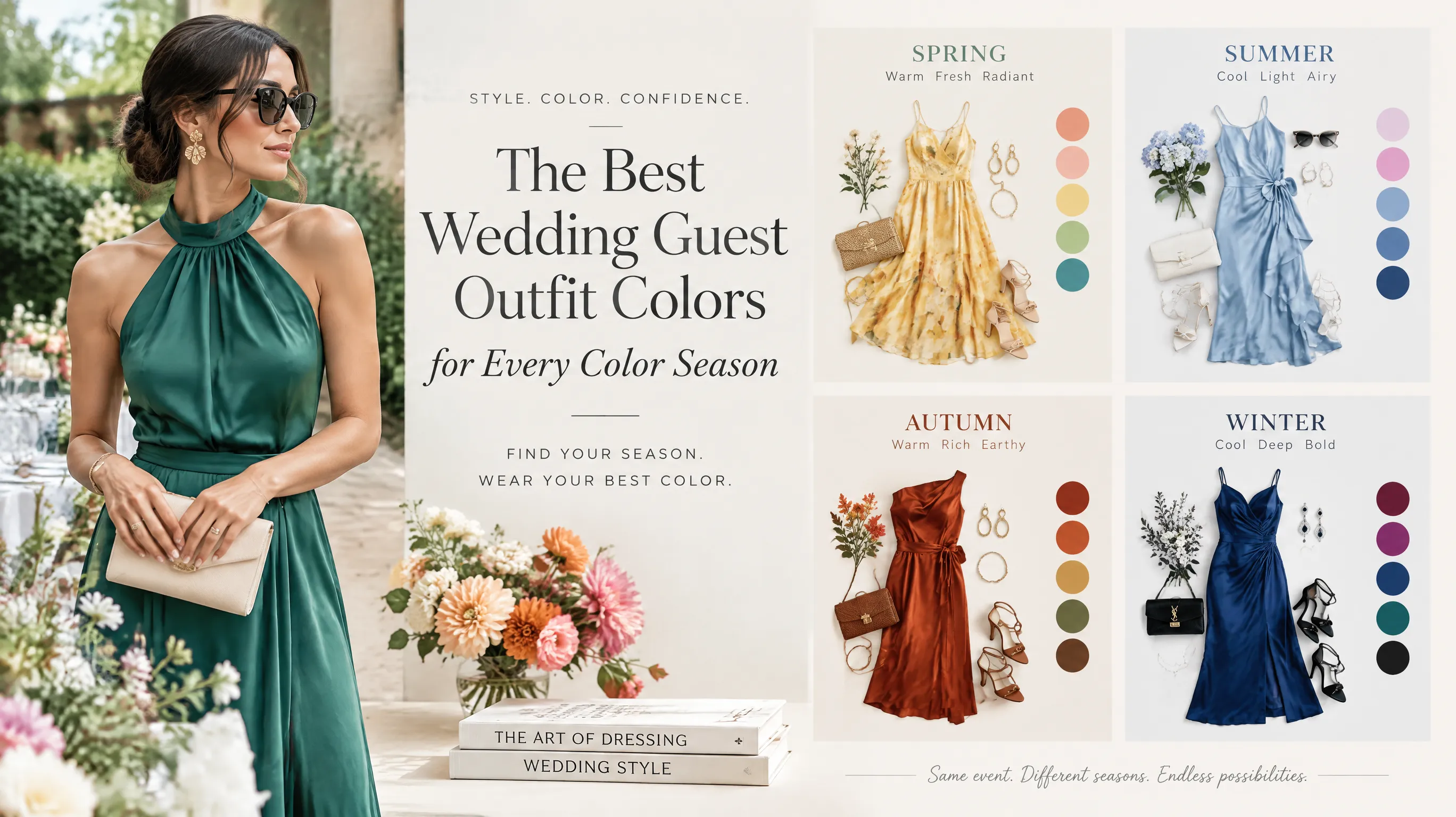
The Dress I Almost Wore to My Best Friend's Wedding
Last spring, I found what I thought was the perfect wedding guest dress: a bright coral midi with a fitted bodice and flowy skirt. It looked incredible online. It looked decent on the hanger. But the moment I tried it on and stood in front of the mirror, something was off.
My skin looked sallow. My under-eye circles seemed deeper. The color was fighting my face instead of framing it. I returned the dress two days before the wedding and panic-bought a dusty mauve alternative that I wasn't sure about — and ended up getting more compliments on it than anything I'd worn in months.
That's when it clicked: the color of your outfit matters more than the cut, the brand, or the price tag. And if you know your color season, choosing the right wedding guest outfit becomes almost effortless.
Why Wedding Guest Colors Matter More Than You Think
Weddings are photographed events. You'll appear in candid shots, group photos, and someone's phone video of the first dance. The color you wear determines whether you look radiant or washed out in every single one of those images.
Beyond photos, weddings happen under variable lighting — outdoor ceremonies in full sun, indoor receptions under warm tungsten bulbs, dance floors under colored spotlights. A color that works with your natural coloring will hold up across all of those environments. A wrong color won't.
There's also the etiquette dimension. Most people know to avoid white, but fewer consider the overall color harmony of their outfit with their own skin, hair, and eye coloring. The best-dressed wedding guests aren't wearing the trendiest outfits — they're wearing colors that make them glow.
See your personal color palette now
Upload a photo — get your AI beauty report in 60 seconds.
A Quick Color Season Refresher
If you already know your season, skip ahead. If not, here's the short version:
Personal color analysis sorts people into one of 12 sub-seasons based on three characteristics of their natural coloring:
- Undertone — warm (golden, peachy) or cool (pink, blue)
- Value — light or deep
- Chroma — bright/clear or soft/muted
The four main seasons break down into three sub-seasons each:
| Season | Sub-Seasons | Key Quality |
|---|---|---|
| Spring | Light Spring, True Spring, Bright Spring | Warm, fresh, light-to-medium |
| Summer | Light Summer, True Summer, Soft Summer | Cool, muted, gentle |
| Autumn | Soft Autumn, True Autumn, Deep Autumn | Warm, rich, earthy |
| Winter | Deep Winter, True Winter, Bright Winter | Cool, high-contrast, dramatic |
Not sure which one you are? A quick AI color analysis can determine your sub-season from a photo in under a minute.
The Best Wedding Guest Colors by Season
Spring Types: Light, Warm, and Radiant
Your palette strength: Fresh, warm, energetic colors that reflect light.
Light Spring — Think soft pastels with warmth: peach, light coral, warm pink, buttercup yellow, light aqua. A blush pink chiffon dress or a pale coral wrap dress is your sweet spot. Avoid anything too dark or heavily saturated — it overwhelms your delicate coloring.
True Spring — Your colors are warmer and slightly bolder: salmon, tangerine, golden yellow, warm turquoise, spring green. A vibrant coral midi dress or a sunny golden jumpsuit makes you look alive. You can handle more color intensity than Light Spring.
Bright Spring — You thrive in clear, vivid colors: hot coral, electric turquoise, bright yellow-green, fuchsia, royal blue. A bright turquoise cocktail dress or a vivid coral sheath makes your eyes pop. Avoid dusty or muted shades — they make you look tired.
Spring types should avoid: Black (too harsh), burgundy (too cool-dark), mauve/dusty rose (too muted), navy if it's too dark.
Summer Types: Cool, Soft, and Graceful
Your palette strength: Muted, cool-toned colors with a gentle, elegant quality.
Light Summer — Soft pastels with cool undertones: lavender, powder blue, soft pink, light mauve, icy mint. A lavender midi dress or a soft blue-gray silk blouse with trousers is perfection. You look best in colors that seem lightly frosted.
True Summer — Medium-depth cool colors: raspberry, blue-toned pink, periwinkle, soft teal, dusty rose. A raspberry-toned wrap dress or a cool dusty rose gown feels natural and sophisticated. Stick to the middle range — not too light, not too dark.
Soft Summer — Your magic is in muted, blended tones: sage, dusty blue, mauve, cocoa, soft plum. A sage green midi dress or a muted dusty blue jumpsuit looks effortlessly chic. Hard, bright colors are your worst enemy — they compete with your naturally subtle coloring.
Summer types should avoid: Orange (too warm), bright yellow (too vivid), rust (too warm-dark), neon anything.
Autumn Types: Warm, Rich, and Earthy
Your palette strength: Warm, deep, organic colors with golden undertones.
Soft Autumn — Muted warmth: warm taupe, sage green, dusty peach, soft terracotta, muted olive. A warm taupe silk dress or a dusty peach midi with gold accessories looks stunning without trying too hard. Your colors have a "sun-washed" quality.
True Autumn — Rich, saturated earth tones: burnt orange, olive, rust, warm teal, mustard. A rust-colored wrap dress or a rich olive midi with copper jewelry is chef's kiss. You're one of the few seasons that genuinely looks better in orange than pink.
Deep Autumn — Your power colors are dark and warm: chocolate brown, deep olive, burgundy with warm undertones, dark teal, brick red. A deep teal gown or a warm burgundy dress gives you a commanding presence. You can handle depth that would swallow lighter seasons.
Autumn types should avoid: Pastel pink (too cool-light), icy blue (too cold), bright white (too stark), fuchsia (too cool-vivid).
Winter Types: Cool, Bold, and Dramatic
Your palette strength: High-contrast, clear, cool-toned colors with intensity.
Deep Winter — Your colors are dark and cool: navy, deep plum, emerald, true red, charcoal. A deep plum column dress or an emerald green cocktail dress is striking without being flashy. You own dark colors in a way other seasons can't.
True Winter — Pure, icy, medium-to-dark tones: royal blue, true red, magenta, pine green, icy pink. A royal blue midi dress or a true red sheath is jaw-dropping. Your colors are "pure" — no warmth, no dustiness, just clear pigment.
Bright Winter — Vivid, high-voltage cool tones: electric blue, hot pink, bright emerald, violet, cherry red. A hot pink cocktail dress or a vivid emerald jumpsuit turns heads. You need intensity — muted pastels make you disappear.
Winter types should avoid: Beige (too soft-warm), muted earth tones (too warm-muted), camel (too warm), pale yellow-greens.
The Universal Wedding Guest Color Cheat Sheet
Some colors work across multiple seasons with slight shade adjustments:
| Color Family | Best For | Shade Notes |
|---|---|---|
| Blue | All seasons | Warm teal for Autumn/Spring, cool navy for Winter, dusty blue for Summer |
| Pink | All seasons | Coral for Spring, dusty rose for Summer, berry for Winter, peach for Autumn |
| Green | All seasons | Lime-toned for Spring, sage for Summer, olive for Autumn, emerald for Winter |
| Purple | Summer, Winter | Lavender for Summer, deep plum for Winter — risky for warm seasons |
| Red | Autumn, Winter | Tomato red for Autumn, true red for Winter — too intense for Spring/Summer |
5 Color Mistakes Even Stylish Wedding Guests Make
1. Defaulting to black "because it's safe"
Black is only genuinely flattering on Winter types. On Springs and Light Summers, it creates harsh shadows under the eyes and makes you look older. If you want a neutral, try navy (cooler seasons) or chocolate brown (warmer seasons) instead.
2. Matching the bridal party colors
Bridesmaids often wear dusty pastels or specific palette colors. Wearing the same shade makes you look like a confused member of the wedding party. Check with the couple if you're unsure what the party is wearing.
3. Choosing based on trend instead of season
"Butter yellow is the color of 2026" means nothing if you're a Deep Winter. Trends are suggestions, not mandates. Your best color at every wedding is the one that makes your skin glow — regardless of what's trending.
4. Ignoring the venue lighting
An outdoor garden wedding in daylight is radically different from an evening ballroom reception. Lighter, brighter colors photograph best outdoors. Richer, deeper tones hold up better in warm indoor lighting. If the event spans both, mid-range saturation is your safest bet.
5. Overlooking fabric and color interaction
The same "emerald green" looks completely different in matte crepe vs. satin vs. sequins. Shiny fabrics reflect light and appear lighter and cooler. Matte fabrics absorb light and appear deeper and warmer. A Deep Autumn might love emerald in matte jersey but find it too icy in satin.
How to Test Before You Buy
Here's my three-step system for avoiding color regret:
Step 1: Hold it to your face in natural light. Not store lighting — actual daylight near a window. Does your skin look even and bright, or does it look gray/yellow/red? Trust the first impression.
Step 2: Take a photo. Your phone camera is less forgiving than the mirror. If the color looks off in a quick selfie, it'll look worse in wedding photos taken from across the room.
Step 3: Try an AI color analysis. Tools like AI-powered color analysis can now preview how specific outfit colors interact with your natural coloring — no guesswork required. It's especially helpful when you're torn between two similar shades.
Key Takeaways
- Your color season determines which outfit colors make you glow in photos versus drain your complexion
- Spring types look best in warm, fresh colors; Summer types in cool, muted tones; Autumn types in rich earth tones; Winter types in bold, clear cool colors
- Black isn't universally flattering — only Winter types genuinely suit it
- Always test color against your face in natural daylight before committing
- Consider the venue lighting: lighter colors for outdoor, richer tones for evening indoor events
The next wedding invitation you get doesn't have to trigger a shopping panic. Know your season, pick from your palette, and focus on fit and fabric. The color will do the heavy lifting.
Related Articles
- How to Build a Capsule Wardrobe for Your Color Season — Apply seasonal colors to your everyday wardrobe
- The Best Makeup Colors for Every Color Season: A Complete Chart — Complete your wedding guest look with the right makeup
- How to Shop Online for Your Color Season (Without Getting It Wrong) — Buy the right colors online with confidence
- Color Analysis: The Complete Guide — Everything you need to know about finding your best colors
Want to try AI color analysis yourself?
Upload one photo and get a magazine-level beauty report in 60 seconds.
Start Free AnalysisRelated Posts
How to Transition Your Color Palette From Spring to Summer (Without Starting Over)
Struggling to adapt your wardrobe when the weather shifts? Here's a practical guide to transitioning your color palette from warm Spring tones to cool Summer hues — using what you already own.
How to Shop Online for Your Color Season (Without Getting It Wrong)
Online shopping is tricky when you can't see colors in person. Learn practical strategies for buying clothes in your color season palette — from screen calibration to return-proof color matching.
I Wore Only My 'Season Colors' for 30 Days — Here's What Happened
A personal experiment in dressing exclusively in my color season palette for a full month. The compliments, the surprises, and the unexpected lessons about personal style.
How to Build a Capsule Wardrobe for Your Color Season (Step-by-Step)
Learn how to create a versatile capsule wardrobe based on your color season. From choosing neutrals to accent pieces, this guide turns color analysis into a practical shopping strategy.