How Color Theory From Art Class Applies to Your Personal Style
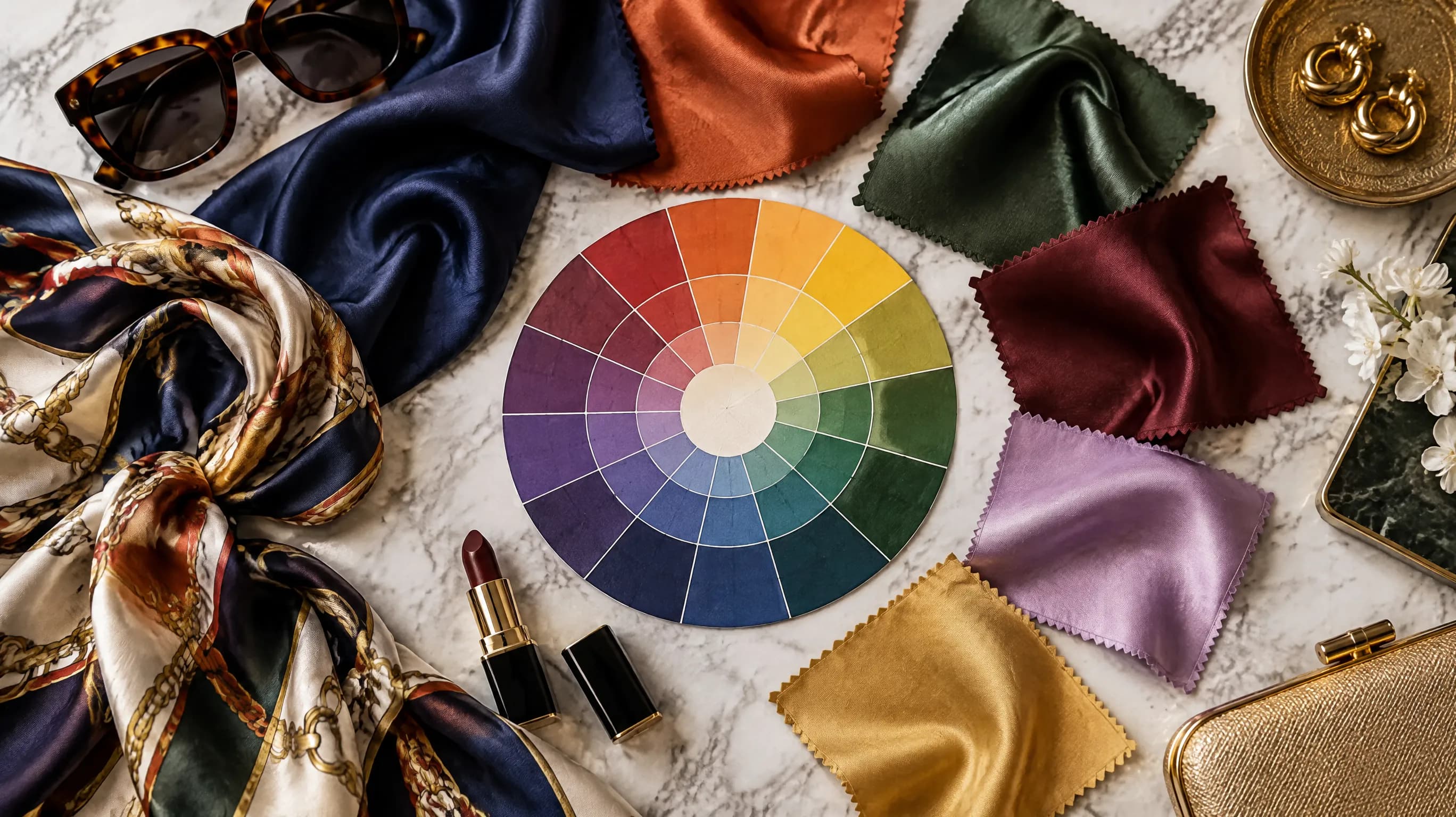
That Color Wheel You Ignored in Art Class? It's a Fashion Weapon.
Remember the color wheel from middle school art? Primary colors, secondary colors, maybe a vague mention of "complementary" before you went back to finger-painting?
Turns out, that simple circular chart is one of the most powerful styling tools in existence — and almost nobody in the fashion world talks about it properly.
Professional stylists, interior designers, and brand consultants use color theory every single day. The exact same principles that make a painting feel harmonious or a logo feel trustworthy also determine why certain outfits look effortlessly polished while others feel "off" no matter how expensive the pieces are.
I spent years thinking color coordination was intuitive — something you either had a "feel" for or didn't. Then I actually studied the theory behind it, and everything clicked. There are rules. They're learnable. And they work.
In this article, I'll break down the core color theory concepts that matter for personal style — no art degree required.
The Color Wheel: Your 60-Second Refresher
Before we get into outfits, let's make sure we're speaking the same language.
The color wheel organizes colors by their relationships. There are three properties of any color that matter for styling:
Hue — the actual color family (red, blue, green, etc.)
Value — how light or dark the color is (navy is a dark-value blue; baby blue is a light-value blue)
Saturation — how vivid or muted the color is (a bright cherry red vs. a dusty rose — same hue family, wildly different saturation)
Most styling advice only talks about hue. "Wear blue with orange." But value and saturation are where the real magic happens — and where most outfit fails actually come from. More on that later.
The 12 Colors on the Wheel
The standard color wheel has 12 positions:
- Primary: Red, Yellow, Blue
- Secondary: Orange (red + yellow), Green (yellow + blue), Purple (red + blue)
- Tertiary: Red-Orange, Yellow-Orange, Yellow-Green, Blue-Green, Blue-Purple, Red-Purple
Every color you own fits somewhere on this wheel. Even "neutrals" like brown (dark orange), burgundy (dark red-purple), or olive (dark yellow-green) have positions.
Understanding where your wardrobe colors sit on the wheel unlocks specific combination strategies that artists have used for centuries.
See your personal color palette now
Upload a photo — get your AI beauty report in 60 seconds.
The 5 Color Harmonies That Actually Matter for Style
Color theory defines several types of "harmonies" — combinations that create visual balance. Here are the five that translate directly to outfits.
1. Complementary Colors (Across the Wheel)
Complementary colors sit directly opposite each other on the color wheel. They create maximum contrast and visual energy.
Classic pairs: Blue + Orange, Red + Green, Yellow + Purple
How it works in fashion:
- A navy blazer with a burnt orange scarf
- A forest green dress with burgundy (dark red) accessories
- A lavender sweater with a gold (yellow) necklace
The rule: Complementary outfits feel dynamic and confident. They're eye-catching without being chaotic because the colors balance each other's energy.
The trap: Using both colors at full saturation in equal amounts. That's a costume, not an outfit. Instead, make one color dominant (70%+) and the other an accent (30% or less). Or desaturate one — pair a vivid blue with a muted, earthy orange rather than two screaming neon tones.
2. Analogous Colors (Neighbors on the Wheel)
Analogous colors sit next to each other on the wheel — typically three consecutive colors.
Examples: Blue + Blue-Green + Green. Or Red + Red-Orange + Orange.
How it works in fashion:
- A teal top with dark green pants and a blue bag
- A coral dress with peach accessories and a warm red lip
- A burgundy coat over a plum sweater with a mauve scarf
The rule: Analogous outfits feel harmonious and sophisticated. They're the reason "tonal dressing" looks so effortlessly elegant — your eye flows smoothly across the colors because there are no jarring jumps.
The trap: Without enough value or saturation variation, analogous outfits can look flat. Make sure your three colors differ in lightness or brightness, not just hue. A dark navy, a medium teal, and a light mint are all in the blue-green family but create depth through value contrast.
3. Triadic Colors (Three Equally Spaced)
Triadic colors form an equilateral triangle on the wheel. Three colors, evenly spaced, 120 degrees apart.
Classic triads: Red + Yellow + Blue. Orange + Green + Purple.
How it works in fashion:
- A red dress with blue shoes and a yellow clutch (bold, but it works when saturations are controlled)
- A mustard cardigan with olive pants and a plum bag (the muted version — same triad, way more wearable)
- A coral top, turquoise earrings, and a lavender skirt (the spring version)
The rule: Triadic combinations feel vibrant and balanced. They work best when one color dominates and the other two play supporting roles.
The trap: Three equally bright, equally saturated triadic colors is overwhelming. Choose one saturated color and mute the other two — or mute all three for a softer, more editorial look.
4. Split-Complementary (A Gentler Version of Complementary)
Instead of the exact opposite color, you take the two colors adjacent to the complement. So instead of blue + orange, you'd use blue + red-orange + yellow-orange.
How it works in fashion:
- A cobalt blue dress with rust accessories and a golden tan bag
- A purple coat over a yellow-green top with gold jewelry
- Teal jeans, coral earrings, and a warm peach blouse
The rule: Split-complementary gives you the visual interest of complementary colors but with more nuance and less "costume" risk. It's one of the easiest harmonies to wear because it looks intentional without looking matchy.
The trap: Overcomplicating it. Stick to one dominant + two accents and you're golden.
5. Monochromatic (One Hue, Multiple Values)
Same color family, different lightness and saturation levels. This is "tonal dressing" taken to its logical conclusion.
How it works in fashion:
- Head-to-toe blue: navy coat, medium blue shirt, light chambray pants
- All green: deep emerald jacket, sage shirt, mint accessories
- The famous "all-camel" outfit: tan coat, lighter tan sweater, darker brown bag, cream scarf
The rule: Monochromatic outfits look more expensive and put-together than they actually are. They elongate the body (no color blocks to break up your silhouette) and always read as intentional.
The trap: Same value across everything. If your top, bottoms, and accessories are all the exact same shade, you look like a paint sample. Create a gradient — dark at the bottom, light on top, or vice versa — to add visual depth.
The Secret Ingredient Most People Miss: Value Contrast
Here's the thing art school teaches that fashion advice rarely mentions:
The relative lightness and darkness of your colors matters more than the colors themselves.
You can pair any two hues and make them work if the value contrast is right. And you can pair "matching" colors and have them look terrible if the values clash.
What Is Value Contrast?
Value is how light or dark a color is, independent of its hue. Close your eyes and imagine a black-and-white photo of your outfit. The tonal differences you'd see? That's value contrast.
- High value contrast: A white shirt with dark navy pants. A black dress with cream accessories. These read as crisp and defined.
- Low value contrast: A medium gray sweater with medium blue pants. A camel coat with olive trousers. These read as soft and sophisticated.
- Medium value contrast: The sweet spot most people naturally gravitate toward — but it's worth understanding why.
Value Contrast and Your Personal Coloring
Here's where color theory meets personal color analysis: your natural coloring has an inherent value contrast level.
- High contrast: Dark hair + light skin + vivid eyes (think: Deep Winter, Bright Winter). You look best in outfits with high value contrast — dark darks and light lights.
- Low contrast: Hair, skin, and eyes all within a similar lightness range (think: Soft Summer, Soft Autumn). You look best in outfits with low value contrast — tonal, muted, no jarring jumps.
- Medium contrast: Most people fall here. A moderate difference between hair, skin, and eye lightness. Medium value contrast in outfits works best.
This is why a person can wear the "right" color season palette but still look off — if the value contrast within their outfit doesn't match their personal contrast level, something feels wrong even though every color technically belongs to their palette.
Saturation: The Other Half of the Equation
If value is about light vs. dark, saturation is about vivid vs. muted. And it matters just as much.
High saturation means pure, vivid color — the kind that jumps off a screen. Fire engine red. Electric blue. Kelly green.
Low saturation means muted, "dusty" color — like someone mixed in a little gray. Dusty rose. Sage green. Steel blue.
The Saturation Matching Rule
Your outfit's saturation level should be internally consistent. Mixing high-saturation and low-saturation pieces in the same outfit creates visual discord because they look like they belong in different lighting conditions.
Works: Bright coral top + vivid turquoise earrings (both high saturation) Works: Dusty rose sweater + muted sage pants (both low saturation) Doesn't work: Neon yellow bag + dusty mauve coat (saturation mismatch — one looks "new" and the other looks "washed")
This explains a lot of the "I don't know why this outfit doesn't work" situations. Everything might be the right hue, the right value — but if one piece is vivid and another is muted, they fight each other.
Saturation and Your Color Season
This connects directly to personal color analysis:
- Bright/Clear seasons (Bright Spring, Bright Winter) → high-saturation outfits
- Muted/Soft seasons (Soft Summer, Soft Autumn) → low-saturation outfits
- Pure/True seasons (True Spring, True Summer, True Autumn, True Winter) → moderate-to-high saturation
- Light seasons (Light Spring, Light Summer) → moderate saturation, lighter values
- Deep/Dark seasons (Deep Autumn, Deep Winter) → moderate saturation, darker values
When you match both the value contrast AND saturation level of your outfit to your personal coloring, you get that "wow, you look amazing today" effect where people notice YOU before they notice your clothes.
Practical Outfit Formulas Using Color Theory
Let's turn theory into practice. Here are ready-to-use formulas:
The "Safe Bold" Formula
One saturated color + two neutrals that match your contrast level.
For a Bright Winter: Vivid red dress + black heels + white bag For a Soft Autumn: Terracotta top + taupe pants + warm beige bag
This works because one bold color anchored by neutrals is always visually balanced.
The "Artistic" Formula
Analogous colors with value variation.
Pick three neighboring colors on the wheel. Make one dark, one medium, one light.
Example: Dark forest green coat + medium teal sweater + light sage scarf. All neighbors on the wheel, different values, effortlessly editorial.
The "Statement" Formula
Complementary colors at different saturations.
Pick two opposite colors. Make one saturated and small (accent), the other desaturated and large (base).
Example: Muted navy outfit + single pop of burnt orange in a bag or scarf. The complementary contrast creates energy, but the saturation difference keeps it wearable.
The "Power" Formula
Monochromatic with one "wrong" accent.
All one color family with a single accent from the opposite side of the wheel.
Example: All-gray outfit (light gray, medium charcoal, dark slate) + one cobalt blue accessory. The monochromatic base creates sophistication, and the complementary pop creates intrigue.
How Technology Makes This Effortless
Here's the honest truth: you don't need to memorize color wheel positions to use these principles. Your eye already senses most of these harmonies subconsciously — that's why some outfit combinations just "feel right."
But if you want precision? AI tools can now analyze your personal coloring and recommend specific color combinations from your optimal palette. A tool like AI color analysis can identify your season, contrast level, and best color families in about 60 seconds — which tells you exactly which harmonies and saturation levels will work best on you.
It's like having a personal color theory tutor that also knows your specific skin undertone, eye color, and natural contrast level.
Common Color Theory Mistakes in Fashion
Mistake 1: "Matching" instead of coordinating Matching means everything is the same color. Coordinating means colors have a deliberate relationship. An all-navy outfit matched with a navy bag, navy shoes, and a navy scarf is "matched." A navy outfit with cognac boots and a cream scarf is "coordinated." Coordinated is almost always better.
Mistake 2: Ignoring undertone within a harmony Blue and orange are complementary — but a cool blue with a warm orange doesn't work as well as a cool blue with a cool-leaning rust, or a warm blue (teal) with a warm orange. The undertone within each color matters.
Mistake 3: Treating black as "neutral" Black isn't neutral in color theory — it's high-value dark with no hue information. For warm-toned people, black near the face can look harsh. Dark brown or charcoal often works better as a "dark neutral" for warm seasons.
Mistake 4: Abandoning principles for trends Neon green + hot pink might be trending. But if you're a Soft Summer with low contrast, that combination will wear YOU. Adapt trends to your principles, not the other way around.
Key Takeaways
- The color wheel isn't just for art class — complementary, analogous, triadic, split-complementary, and monochromatic harmonies all translate directly to outfit combinations
- Value contrast (light vs. dark) matters more than specific colors — match your outfit's value contrast to your natural personal contrast level
- Saturation consistency is the overlooked reason many outfits feel "off" — don't mix vivid and muted pieces carelessly
- Use the four outfit formulas (Safe Bold, Artistic, Statement, Power) as starting points and adjust for your color season
- You don't need to memorize the wheel — AI color analysis tools can identify your optimal harmonies based on your actual features
Color theory is one of those things that, once you see it, you can't unsee it. You'll start noticing why certain storefronts catch your eye, why some Instagram feeds feel effortlessly cohesive, and why certain people always look "put together."
The color wheel has been around for centuries. It's time your closet caught up.
Related Articles
- The Science Behind Personal Color Analysis: How It Actually Works — The optical science behind why certain colors flatter certain people
- How to Build a Capsule Wardrobe for Your Color Season (Step-by-Step) — Put color theory into action with a curated wardrobe
- Soft Autumn vs Soft Summer: The Most Commonly Confused Color Seasons — A deep dive into two seasons where saturation is the key differentiator
- Color Analysis: The Complete Guide — Everything you need to know about finding your best colors
Want to try AI color analysis yourself?
Upload one photo and get a magazine-level beauty report in 60 seconds.
Start Free Analysis