Color Clashing on Purpose: How to Break the 'Rules' of Color Analysis Stylishly
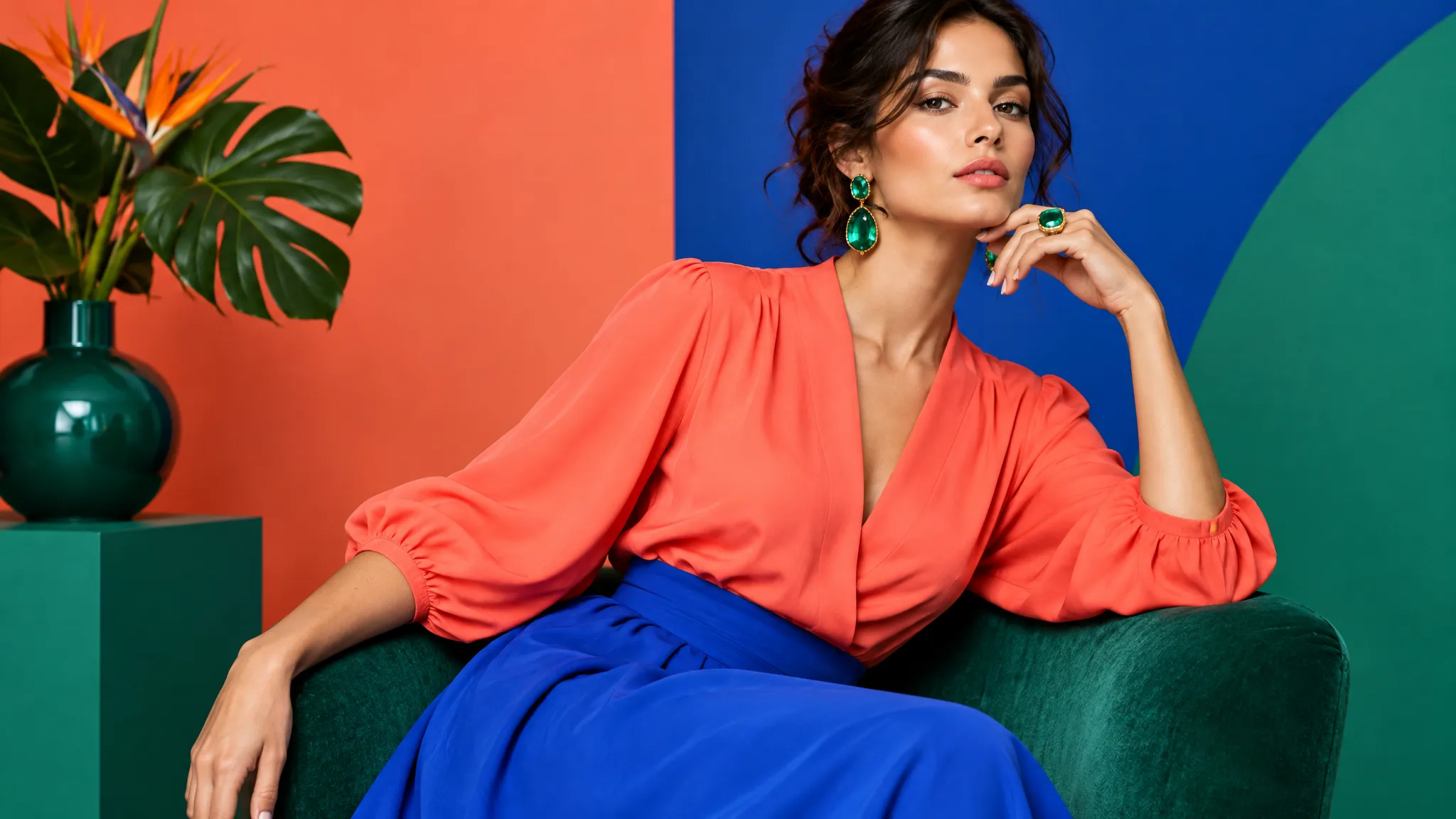
The Color "Rules" Everyone's Afraid to Break
If you've ever gotten your personal color analysis done, you probably walked away with a neat palette card and one overwhelming instruction: stay in your lane.
Spring types get their corals and peaches. Winters own the jewel tones. Summers live in dusty pastels. And if you're an Autumn, earthy warmth is your forever home.
But here's what nobody tells you: the most stylish people in the world break these rules constantly — and they look incredible doing it.
The secret? They're not breaking the rules randomly. They're using color theory principles to clash on purpose, creating outfits that are unexpected, eye-catching, and still deeply flattering.
In this article, I'll show you exactly how to do it — without looking like you got dressed in the dark.
Why "Stay in Your Palette" Is Incomplete Advice
Personal color analysis is genuinely useful. Knowing your undertone, contrast level, and best color family saves hours of frustrating shopping trips and closets full of "meh" outfits.
But treating your palette as a prison misses the point entirely.
Color analysis identifies which colors make your skin glow — the ones that complement your natural coloring so well that people notice you before they notice your clothes. That's the foundation.
What it doesn't account for is visual interest, personal expression, or the reality that fashion is an art form, not a science experiment.
Even professional colorists will tell you: your palette is a starting point, not a finish line.
The Problem With Playing It Too Safe
When you stick exclusively to your palette, a few things happen:
- Your outfits start to look uniform. If every piece is from the same muted, cool family, you can look washed out — ironically, the exact thing color analysis was supposed to prevent.
- You lose contrast. Some of the most striking outfits work because they combine unexpected value contrasts (light vs. dark) or temperature contrasts (warm vs. cool).
- You miss seasonal trends. When Pantone declares "Peach Fuzz" the color of the year, should Winters just sit it out? Absolutely not.
The solution isn't to abandon your palette. It's to learn the principles behind intentional color clashing — so you can break the rules while understanding exactly what you're doing.
See your personal color palette now
Upload a photo — get your AI beauty report in 60 seconds.
The 5 "Legal" Ways to Clash Colors
Not all color clashes are created equal. Some look like a fashion editorial; others look like a laundry accident. Here's the difference.
1. Complementary Clashing (Opposite Colors)
This is the most classic form of intentional clash, and it comes straight from the color wheel.
How it works: Pair colors that sit directly opposite each other — red and green, blue and orange, purple and yellow.
Why it works: Complementary colors create maximum visual contrast, making both colors appear more vibrant. Your eye naturally finds these pairings satisfying because they contain the full spectrum of warm and cool.
How to do it well:
- Keep one color dominant (70%) and the other as an accent (30%)
- Use muted or tonal versions rather than full-saturation primaries
- A rust-orange top with a teal bag works; a neon orange shirt with kelly green pants... requires confidence
Real example: A Cool Summer wearing a dusty blue blazer with a terracotta-toned scarf. The terracotta is "off-palette" but creates a stunning warm-cool tension that makes the blue pop.
2. Split-Complementary Clashing
How it works: Instead of the direct opposite, pick the two colors flanking it. If your base is blue, instead of pairing with orange, you'd use red-orange and yellow-orange.
Why it works: You get 90% of the visual pop of complementary pairing but with more harmony and less risk of looking like a sports team uniform.
Real example: A Bright Spring wearing her coral (home territory) with both teal earrings and a violet clutch. The split-complementary relationship keeps it visually connected while feeling bold.
3. Warm Accent in a Cool Outfit (and Vice Versa)
This is the most practical color clash for daily dressing.
How it works: Build your outfit in your palette's temperature (warm or cool), then add one deliberate accent in the opposite temperature.
Why it works: The contrast draws the eye to the accent piece, creating a focal point. It also prevents the "everything matches too perfectly" look that can feel costumey.
For cool palettes (Summer/Winter):
- A full cool-toned outfit with warm gold jewelry
- Navy and grey with a cognac leather belt or bag
- A cool-toned dress with warm-toned shoes (think burgundy heels with a slate-blue dress)
For warm palettes (Spring/Autumn):
- Earth tones head to toe with silver statement earrings
- A warm camel coat with a cool grey cashmere scarf
- Olive green pants with a cool lavender top
4. The "Wrong" Neutral Strategy
Neutrals have temperatures too, and mixing them is one of the easiest clashes to pull off.
Warm neutrals: camel, cognac, cream, tan, chocolate brown, olive Cool neutrals: charcoal, navy, black, slate grey, white, taupe
How it works: Combine warm and cool neutrals in the same outfit. This sounds basic, but it violates the "stay in your temperature lane" rule — and it looks phenomenal.
Real examples:
- Black trousers (cool) with a camel blazer (warm) — a fashion editor staple
- Navy coat (cool) with brown leather boots (warm) — yes, navy and brown DO go together
- Charcoal suit (cool) with a cream turtleneck (warm) — instant sophistication
This works because neutrals are low-saturation, so the temperature clash is subtle. Your eye reads it as "interesting" rather than "clashing."
5. The Saturation Mismatch
How it works: Pair a highly saturated color with a muted version of another color from a completely different family.
Why it works: When one color is bold and the other is muted, they don't compete for attention. The muted color acts as a supporting player, letting the bold color be the star.
Real example: A Soft Autumn (whose palette is all muted tones) wearing a deep, saturated cobalt blue scarf (way off-palette) with her usual dusty olive and oatmeal outfit. The cobalt reads as a confident pop, not a mistake, because everything else stays muted.
The Clashing Cheat Sheet by Color Season
Here's a quick reference for how each season type can strategically go "off-palette":
Warm Seasons (Spring & Autumn)
| Strategy | Example Clash |
|---|---|
| Cool accent jewelry | Rose gold → try platinum/silver statement piece |
| One cool-toned top | Pair cool lavender or icy pink with warm bottoms |
| Cool neutral base | Black jeans + warm camel sweater + gold accessories |
| Complementary pop | Warm coral outfit + teal shoes or bag |
Cool Seasons (Summer & Winter)
| Strategy | Example Clash |
|---|---|
| Warm accent leather | Cool greys → add cognac belt or tan bag |
| One warm statement | Warm terracotta or mustard scarf with cool base |
| Warm neutral base | Brown trousers + cool blue shirt + silver jewelry |
| Complementary pop | Cool navy outfit + burnt orange clutch |
3 Rules That Still Apply (Even When Clashing)
Breaking color rules doesn't mean there are no rules. These three principles keep intentional clashing looking intentional rather than accidental:
Rule 1: Match Your Value Contrast
Value = how light or dark a color is. If you're a high-contrast type (Deep Winter, Bright Spring), your clashing colors should also have high contrast between them. If you're low-contrast (Soft Summer, Soft Autumn), keep the clash subtle — muted tones in unexpected combinations.
Rule 2: Keep One Anchor
Every outfit needs a visual anchor — one color that dominates and feels "right" for you. The clash should be a supporting player (accessory, one garment, a shoe), not the whole outfit.
Formula: 60% palette color + 30% neutral + 10% off-palette clash
Rule 3: Your Face Still Wins
The most important color in your outfit is whatever is closest to your face. Your collar, neckline, scarf, earrings — those should usually be in your palette. You can go wild below the waist or in accessories, but keep the face-framing area flattering.
This is why a Cool Winter can wear warm camel pants without issue — the pants are far from the face. But a warm mustard turtleneck on the same person? That might need adjusting.
How to Test a Color Clash Before Committing
Not sure if your planned clash will work? Here are three quick tests:
-
The Squint Test. Hold the two items together and squint. If the colors blur into a pleasant combination, you're good. If one color seems to vibrate or disappear, the clash is too aggressive.
-
The Instagram Test. Take a quick mirror photo. Color clashes that work in person often photograph even better. If it looks good on camera, it works.
-
The AI Test. Modern color analysis tools can analyze which colors brighten your complexion versus which drain it. Use this as your baseline, then experiment with off-palette additions one piece at a time.
Celebrity Color Clashers Who Get It Right
Some of the most acclaimed style icons are known for strategic color clashing:
- Zendaya frequently pairs unexpected color combinations — think a warm golden gown with cool-toned violet jewelry. Her stylist understands that contrast creates memorable red carpet moments.
- Cate Blanchett is a Cool Summer who regularly incorporates warm metallics and earthy accessories into cool-toned outfits. The contrast elevates rather than diminishes.
- Lupita Nyong'o wears bold complementary color pairings (cobalt + orange, fuschia + green) that honor her Deep Winter coloring while being wildly creative.
The common thread? None of these women abandoned their natural coloring. They used it as a foundation and built unexpected combinations on top of it.
Key Takeaways
- Your color season palette is a starting point, not a prison — the most stylish outfits often include strategic off-palette choices
- Complementary colors (opposites on the color wheel) create the boldest clashes; temperature mixing (one warm accent in a cool outfit) is the easiest daily strategy
- Always keep your face-framing colors in your palette — you can experiment more freely below the waist and in accessories
- Match your contrast level when clashing: high-contrast types can go bold, low-contrast types should keep it subtle
- The best color clashers aren't ignoring the rules — they understand them deeply enough to know which ones can bend
Color analysis gives you the science. Style gives you the art. The magic happens when you use both.
Related Articles
- Color Analysis: The Complete Guide — Everything you need to know about finding your best colors
- How Color Theory From Art Class Applies to Your Personal Style — The science behind why certain color combinations work
- How to Build a Capsule Wardrobe for Your Color Season — Build a foundation wardrobe in your best colors first
- I Wore Only My 'Season Colors' for 30 Days — Here's What Happened — What strict palette adherence taught one writer about flexibility
Want to try AI color analysis yourself?
Upload one photo and get a magazine-level beauty report in 60 seconds.
Start Free Analysis