I Tried Color Analysis on My Entire Friend Group — 5 Women, 5 Seasons, 5 Surprising Lessons
It Started With a Wine Night Argument
Last month, my friend Priya made a bold claim over a glass of Merlot.
"You should never wear that shade of yellow," she said, gesturing at my sweater. "It makes you look, like... tired."
I looked down. It was my favorite canary-yellow sweater — the one I'd gotten compliments on exactly once, from my mother, who compliments everything. Deep down, I knew Priya was probably right. The yellow had always felt slightly off against my skin, like wearing someone else's glasses.
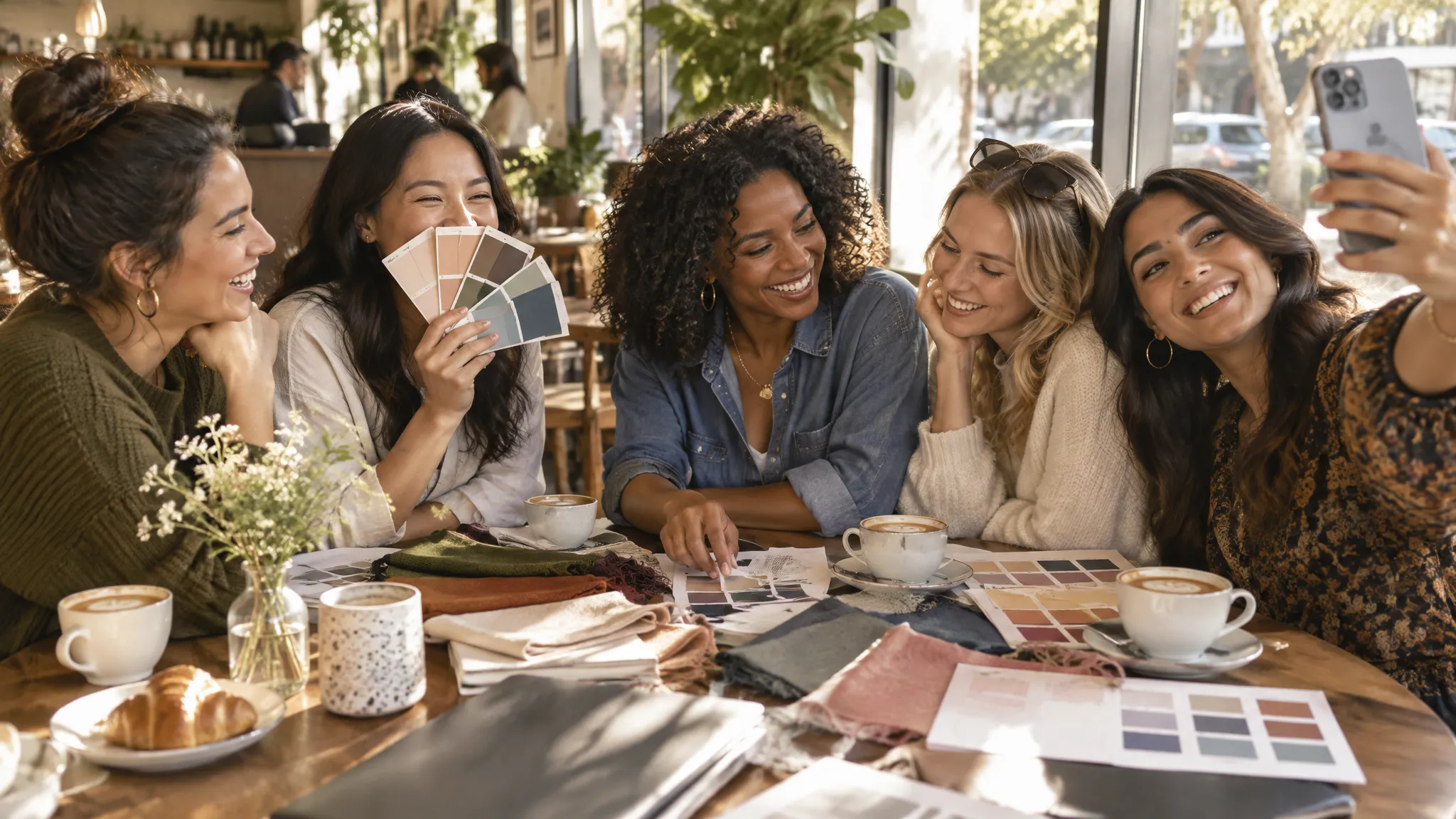
That casual insult launched what became one of the most eye-opening group experiments I've ever done. Within two weeks, I'd convinced all five of us — me, Priya, Jordan, Mei, and Tasha — to take an AI color analysis together and spend a month putting our results to the test.
Here's what we learned, and why some of the results genuinely shocked us.
The Setup: Five Friends, One Saturday, One App
We picked a Saturday afternoon, gathered at Jordan's apartment with coffee and pastries, and each took an AI color analysis on our phones. The process itself was simple: upload a selfie in natural lighting, and the AI analyzes your skin undertone, contrast level, and overall coloring to determine your seasonal color type out of the 12-season system.
Within minutes, each of us had our results:
- Me (Sarah): Soft Summer — cool, muted, medium depth
- Priya: Deep Autumn — warm, rich, deep
- Jordan: Light Spring — warm, bright, light
- Mei: Cool Winter — cool, clear, high contrast
- Tasha: Warm Autumn — warm, earthy, medium-deep
Five women. Five different seasons. One apartment full of opinions.
See your personal color palette now
Upload a photo — get your AI beauty report in 60 seconds.
Lesson 1: Your "Signature Color" Might Be Your Worst Color
This was the first shock. When we compared our go-to wardrobe colors with our actual season palettes, three out of five of us were wearing colors that actively worked against us.
Exhibit A: Jordan's black wardrobe crisis. Jordan is a self-described "all-black-everything" person. Her closet looked like a New York fashion editor's — sleek, monochrome, sophisticated. But her Light Spring result said something uncomfortable: pure black is one of the harshest colors she could wear.
"That can't be right," she said, scrolling through her palette. Her best neutrals were warm ivory, camel, and soft taupe — literally the opposite of her entire wardrobe.
We made her try on a cream blouse right there (Priya had one that sort of fit), and the difference was... undeniable. The cream next to her face looked luminous. The black, by comparison, made her look washed out and sharp in the wrong way.
Exhibit B: My yellow sweater. As a Soft Summer, I should be wearing muted, cool-leaning colors — dusty rose, sage green, cool taupe. Canary yellow? That's a Spring color. Bright, warm, and completely wrong for my muted, cool coloring. Priya was vindicated.
Exhibit C: Tasha's lifelong love of pastels. Tasha, a Warm Autumn, had a closet full of soft lavender, baby pink, and powder blue — classic Summer colors. When she held up her actual Warm Autumn colors (terracotta, olive, burnt sienna), the shift was dramatic. The warm tones made her dark skin look richer and more radiant, while the pastels she'd been wearing made her complexion look slightly ashy.
The takeaway: The color you like isn't always the color that likes you back. Three of us had built entire wardrobes around colors that were making us look worse.
Lesson 2: Undertone Is Not the Same as Skin Color
Before this experiment, I think all of us assumed that your skin color (how light or dark you are) determined what colors looked good on you. It doesn't.
Tasha and Priya are both women of deeper complexion, but their seasons are completely different. Tasha is a Warm Autumn (golden-warm undertone), while Priya is a Deep Autumn (also warm, but much richer and deeper). Mei, who has light-medium East Asian skin, is a Cool Winter — which means she shares a cool undertone with... me, a fair-skinned Soft Summer.
This was genuinely revelatory. Undertone operates independently of skin depth. A very fair person and a deep-skinned person can have the same undertone and look best in similar color families.
When we lined up and compared palettes, the patterns were clear:
| Person | Skin Depth | Undertone | Best Colors |
|---|---|---|---|
| Me (Sarah) | Light | Cool | Dusty rose, sage, lavender |
| Priya | Deep | Warm | Forest green, burgundy, bronze |
| Jordan | Light | Warm | Peach, coral, warm ivory |
| Mei | Light-medium | Cool | True red, royal blue, emerald |
| Tasha | Medium-deep | Warm | Terracotta, olive, mustard |
The two cool-toned people (me and Mei) both look washed out in orange and mustard. The three warm-toned people (Priya, Jordan, Tasha) all struggle with icy pink and lavender. Skin depth had nothing to do with it.
Lesson 3: The "Wrong" Colors Don't Just Look Bad — They Actually Change Your Face
This was the lesson that converted the last skeptic in our group (Jordan, who still thought black was her color).
We did a very unscientific but surprisingly effective test: each person held a piece of fabric in their worst recommended color next to their face, then switched to their best color. We took photos.
The results were almost comically dramatic.
In the wrong color, every single one of us showed the same symptoms: under-eye shadows looked darker, skin looked uneven, jawlines looked less defined, and overall we looked... tired. Like we'd gotten two hours less sleep.
In the right color? Skin looked smoother. Under-eye circles seemed to soften. We looked awake. It was like a natural filter — no makeup involved.
Mei's comparison was the most striking. In a muted olive green (a Soft Autumn color — wrong for her Cool Winter type), she looked genuinely ill. In a bright royal blue, she looked like she'd just come back from vacation. Same lighting, same expression, same afternoon. Only the color changed.
We all saved those comparison photos to our phones, and at least three of us used them as our lock screen for a week.
Lesson 4: Shopping Together in Your Seasons Is Dangerously Fun
About a week after our analysis day, we went shopping together at a mall, but with a new rule: you could only buy things in your season palette.
What happened was unexpected. Shopping normally feels overwhelming — too many options, too much wondering "does this work on me?" With the seasonal palette as a filter, each of us was basically operating with a pre-approved list of colors. The decision fatigue vanished.
Jordan, who was hardest-hit by the "no more black" revelation, found a golden-ivory trench coat that made her look like she belonged in a European film. She'd never once in her life considered buying a cream coat. "This would have been invisible to me before," she said.
Priya went straight for a deep forest green wrap dress and looked so good in it that a saleswoman came over to say so — unprompted.
I found a slate blue blazer that made my eyes look twice as blue. Slate blue. A color I would have walked right past before because it seemed "boring." It turned out to be my power neutral.
The surprising part: we all spent less than we normally would. When you know your colors, you stop impulse-buying things that "might work." Every purchase felt intentional.
Lesson 5: Color Analysis Changes How You See Other People's Style
This was the weirdest side effect, and everyone in our group reported it independently: after learning the 12-season system, you cannot unsee it.
Walking down the street became a different experience. I'd notice someone in a color that clearly wasn't their season and think, "Oh, she's probably a Winter in that warm camel coat — no wonder it looks off." I started noticing when celebrities were styled in their wrong colors on magazine covers (it happens more than you'd think).
Priya started silently color-typing her coworkers. Jordan began evaluating restaurant interiors by their color temperature ("this lighting is so warm, it would make any Summer look terrible"). Tasha started advising her sister on lip colors.
We'd essentially given ourselves a new lens for understanding aesthetics, and it was impossible to turn off. Which, honestly? Was kind of amazing. Every day became a little more visually interesting.
What We Got Wrong (And What Surprised Us)
Not everything went smoothly. A few things surprised us or tripped us up along the way.
The seasonal palette isn't a prison. Early on, Jordan panicked because she thought she could literally never wear black again. That's not how it works. Your seasonal palette is your best range of colors — the ones that flatter you most effortlessly. You can still wear whatever you want. Black near your face? Try a black outfit with a scarf or jewelry in your season colors to break it up. The system is a guide, not a life sentence.
Lighting matters enormously. We noticed that some colors looked different under the fluorescent lights of the mall versus natural window light at home. This is normal — color constancy is a real thing in visual science. Your best colors will still be your best colors, but the effect is most dramatic in natural lighting.
Not everyone loved their palette at first. Mei was initially disappointed with her Cool Winter result because she wanted to be a Soft Autumn (she loved earthy, boho aesthetics). But when she saw how stunning she looked in her actual cool, clear colors — fuchsia, royal blue, emerald — she came around fast. Style preference and color flattery aren't always the same thing, and that's okay.
The AI got it right. This was the verdict from all five of us. We later compared our AI results to online quizzes (which gave us wildly different answers) and to draping videos on YouTube (which were helpful but hard to self-assess). The AI analysis was the most consistent, the fastest, and — based on our fabric test — the most accurate.
3 Months Later: What Stuck?
It's been about three months since our experiment. Here's what's changed:
-
We all dress differently. Not radically, but noticeably. We've each shifted our core wardrobe pieces toward our seasonal colors, especially the items closest to our faces — tops, scarves, glasses, earrings.
-
We compliment each other differently. Instead of "cute dress," it's now "that's such a good Spring color on you." The specificity feels more genuine.
-
Shopping is faster and cheaper. Jordan went from 90-minute browsing sessions to 30-minute targeted trips. She estimates she's saved about $400 by not buying "maybe" items in the wrong colors.
-
We've become color evangelists. Between the five of us, we've introduced color analysis to roughly 15 other friends and family members. It's become our go-to gift recommendation: "Just try it, you won't regret it."
-
Nobody wears that yellow sweater anymore. I donated it. Priya was right.
Key Takeaways
- Your go-to color might not be your best color. Test it against your actual season palette — the results may surprise you.
- Undertone is separate from skin depth. Fair and deep-skinned people can share the same undertone and season type.
- The wrong colors don't just look "meh" — they actively make you look tired. The right ones act like a natural filter.
- Group color analysis is more fun than doing it alone. You learn from each other's comparisons.
- It changes how you see everything. Once you learn the system, you'll notice color flattery (and mismatches) everywhere.
If you've been curious about color analysis but haven't tried it yet, grab a friend — or better yet, a whole group. It's one of those rare beauty discoveries that's genuinely useful, immediately actionable, and way more fun than you'd expect.
Curious about your color season? Try a free AI color analysis and see for yourself — it takes 60 seconds and one selfie.
Related Articles
- I Wore Only My 'Season Colors' for 30 Days — Here's What Happened — One month wearing exclusively my seasonal palette
- How to Build a Capsule Wardrobe for Your Color Season — Practical wardrobe building using your seasonal colors
- The Science Behind Personal Color Analysis: How It Actually Works — The color science that makes this work
- Color Analysis: The Complete Guide — Everything you need to know about finding your best colors
Want to try AI color analysis yourself?
Upload one photo and get a magazine-level beauty report in 60 seconds.
Start Free Analysis