Why Online Color Analysis Quizzes Get It Wrong (And What to Do Instead)
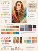
See your own result in 60 seconds
Your 12-season color type, best & worst colors, palette with hex codes
In this article · 10
- 1.The Problem with Color Analysis Quizzes
- 2.Reason #1: You Can't Objectively Assess Your Own Coloring
- 3.Reason #2: Binary Questions Can't Capture a Spectrum
- 4.Reason #3: Photos on Screens Aren't Color-Accurate
- 5.Reason #4: Context Dependence Is Ignored
- 6.Reason #5: The Questions Have No Single Correct Answer
- 7.What Actually Works: Evidence-Based Alternatives
- 8.How to Evaluate Any Color Analysis Tool
- 9.Key Takeaways
- 10.Related Articles
The Problem with Color Analysis Quizzes
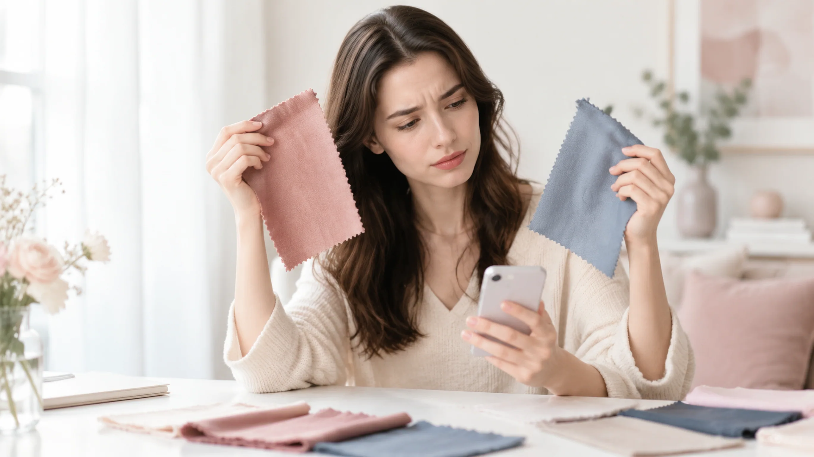
You take one quiz and get "Warm Autumn." You take another and get "Cool Summer." A third one says you're a "Clear Winter." Sound familiar?
If online color quizzes actually worked, you'd get the same answer every time. But most people report getting 2–4 different seasons across different quizzes. That's not a minor discrepancy — those seasons have completely opposite color palettes.
So what's going wrong? It turns out there are fundamental scientific reasons why the quiz format simply cannot deliver accurate color analysis. Let me break down exactly why — and what actually works instead.
Reason #1: You Can't Objectively Assess Your Own Coloring
This is the biggest flaw. Every color quiz asks you to self-report things like:
- "Is your undertone warm or cool?"
- "Are your veins green, blue, or both?"
- "Is your hair warm-toned or cool-toned?"
Here's the problem: undertone is literally the thing you're trying to figure out. Asking someone to identify their own undertone in order to determine their season is circular logic.
Research in color perception shows that humans are remarkably bad at objectively assessing colors on their own bodies. Our perception is influenced by:
- Surrounding colors — the shirt you're wearing changes how your skin looks
- Lighting conditions — fluorescent, LED, and natural light all alter color appearance
- Chromatic adaptation — your eyes automatically "adjust" to what you're used to seeing
- Cultural bias — what you've been told about your coloring may not be accurate
A 2019 study in the Journal of Perceptual Imaging found that untrained observers misidentified skin undertone more than 40% of the time, even under controlled lighting conditions.
Reason #2: Binary Questions Can't Capture a Spectrum
Most quizzes use multiple-choice formats:
"Does gold or silver jewelry look better on you?" A) Gold B) Silver C) Both look fine
But color isn't binary. You exist on a continuous spectrum between warm and cool. There are people who are clearly warm, clearly cool, and everything in between — neutral-warm, neutral-cool, true neutral with olive overtones, etc.
A quiz that forces you to pick "warm" or "cool" at each step will always mistype anyone who falls in the middle. And roughly 30-40% of people have neutral or mixed undertones, making them the majority who get mistyped.
The same applies to other attributes:
- Light vs. dark? What about medium?
- Muted vs. clear? Most people are somewhere between.
- High contrast vs. low contrast? There's a whole range.
Reason #3: Photos on Screens Aren't Color-Accurate
Some "smarter" quizzes ask you to compare photos — holding gold vs. silver fabric, or comparing yourself to celebrity examples.
But unless you've calibrated your monitor, the colors you see on screen are distorted. Studies show that:
- Most consumer monitors have a color temperature of 6500K–7500K (much bluer than natural daylight)
- Screen brightness, contrast settings, and ambient room lighting all shift perceived color
- Photos taken on smartphones auto-adjust white balance, often shifting skin tones warmer or cooler than reality
- Instagram/social media filters further distort any reference photos
A "warm" gold displayed on an uncalibrated monitor might actually appear neutral, leading you to falsely conclude it doesn't suit you.
Reason #4: Context Dependence Is Ignored
Professional color analysts don't just look at your features in isolation — they observe how your skin reacts to different colors placed against it. This is called draping.
When the right color is placed near your face:
- Skin appears smoother and more even
- Dark circles reduce visually
- Facial features look defined and balanced
- The person looks "healthy" and "awake"
When the wrong color is placed near your face:
- Skin looks sallow, grey, or flushed
- Imperfections become more visible
- Features look flat or harsh
- The person appears tired
No quiz can simulate this effect. It requires seeing actual color interaction with your specific skin in real-time. Your skin's surface and underlying pigments create a unique optical interaction with every color — and this can't be reduced to answering "are your veins blue or green?"
Reason #5: The Questions Have No Single Correct Answer
Here's an experiment: take the same quiz twice, one week apart. Many people discover they answer questions differently based on:
- What they're wearing that day
- The lighting when they check their veins
- Their mood and confidence level
- Whether they recently got sun exposure
- Time of day (morning vs. evening lighting)
When the same person can get different results on the same quiz depending on external factors, the method itself is unreliable. A valid assessment tool should produce consistent results regardless of these variables.
What Actually Works: Evidence-Based Alternatives
So if quizzes don't work, what does? Here are methods ranked from most to least accurate:
1. Professional In-Person Draping (Gold Standard)
A certified color analyst places calibrated fabric swatches against your face under controlled lighting (typically north-facing daylight or 5500K calibrated bulbs).
Pros: Most accurate traditional method; you see the results in real-time Cons: $150–400+ per session; limited availability; results depend on analyst skill
2. AI-Powered Photo Analysis (Most Accessible)
Modern AI tools use an AI image model to look at your skin, hair, and eyes in a photo. They judge undertone, contrast level, and color depth from what they see, instead of relying on your own self-reporting.
Pros: Works from your actual photo; fast results; affordable; no self-reporting bias Cons: Requires a well-lit photo; the result is a visual judgment, not a measurement; some tools are better than others
The logic is simple: instead of asking you to guess your own undertone, the tool looks at your coloring and compares it with the 12-season framework. Lighting, camera settings and makeup can still shift the result, which is why it works best as a strong starting point.
Try a free AI color analysis →
3. DIY Draping at Home (Good Supporting Method)
If you understand the principles, you can approximate professional draping at home:
- Remove all makeup; pull hair back
- Stand near a window with north-facing natural light
- Use pure white vs. off-white fabric near your face (determines warm/cool)
- Try silver vs. gold metallic paper (confirms warm/cool)
- Compare muted vs. bright versions of the same hue (determines chroma)
- Take photos at each step for comparison
Pros: Free; gives real color interaction data Cons: Difficult without training; self-assessment bias still applies; lighting control is hard at home
4. Comparative Photo Method (Decent Starting Point)
Take photos of yourself in different colored clothing under consistent lighting:
- Pure white vs. cream
- Bright orange vs. fuchsia
- Olive green vs. blue-green
Compare which makes your skin look healthier. This is imperfect (screen issues apply), but it gives more data than a quiz.
How to Evaluate Any Color Analysis Tool
Before trusting any result — quiz, AI, or otherwise — check these criteria:
| Criteria | Reliable Tool | Unreliable Tool |
|---|---|---|
| Input method | Looks at your actual coloring (photo, draping) | Subjective self-reporting |
| Results consistency | Similar result with similar photos or lighting | Different results each attempt |
| Accounts for neutral | Yes, recognizes warm-neutral and cool-neutral | Binary warm/cool only |
| Uses 12+ seasons | Yes | Only 4 seasons |
| Explains reasoning | Shows which features indicate the result | Just gives a season label |
Key Takeaways
- Color analysis quizzes fail because they rely on self-reporting things you can't objectively assess about yourself
- Binary questions miss the 30–40% of people with neutral or mixed undertones
- Screen color distortion makes photo-comparison quizzes unreliable
- True color analysis requires observing how colors interact with your skin — not answering multiple choice questions
- Your best options are professional draping (expensive but thorough) or AI analysis (affordable and quick, with the caveat that it is a visual judgment)
- If you do use a quiz as a starting point, verify the result with at least one other method
The beauty of modern technology is that getting a solid color analysis starting point no longer requires a $300 appointment. An AI tool can look at your photo instead of asking you to guess, which removes the biggest source of error in quizzes (self-reporting), though not every source of error.
Related Articles
- Color Analysis: The Complete Guide — Everything you need to know about finding your best colors
Want to try AI color analysis yourself?
Upload one photo and get a magazine-level beauty report in 60 seconds.
Start Free AnalysisRelated Posts
Personal Color Analysis Guide: All 12 Seasonal Types Explained (Free Quiz Inside)
The complete guide to personal color analysis with the 12-season system. Learn your color type, best makeup shades, and wardrobe colors. Includes free AI color quiz.
Free AI Color Analysis Online: How to Find Your Colors Without Paying $300
Get a free AI color analysis online in about 60 seconds. Find your season, best palette and styling tips from one selfie, with no appointment needed.
Color Analysis for Dark Skin: Full Guide
Color analysis works beautifully for melanin-rich skin. Find your season, best palette & styling tips for dark and deep skin tones. Free AI tool included.
Olive Skin Color Season: Which Season Are You?
Olive skin rarely fits one season on a quiz. Compare Soft Autumn, Soft Summer, Deep Autumn and Deep Winter, then follow a step-by-step test.