Why Your Foundation Never Matches: An Undertone Deep Dive
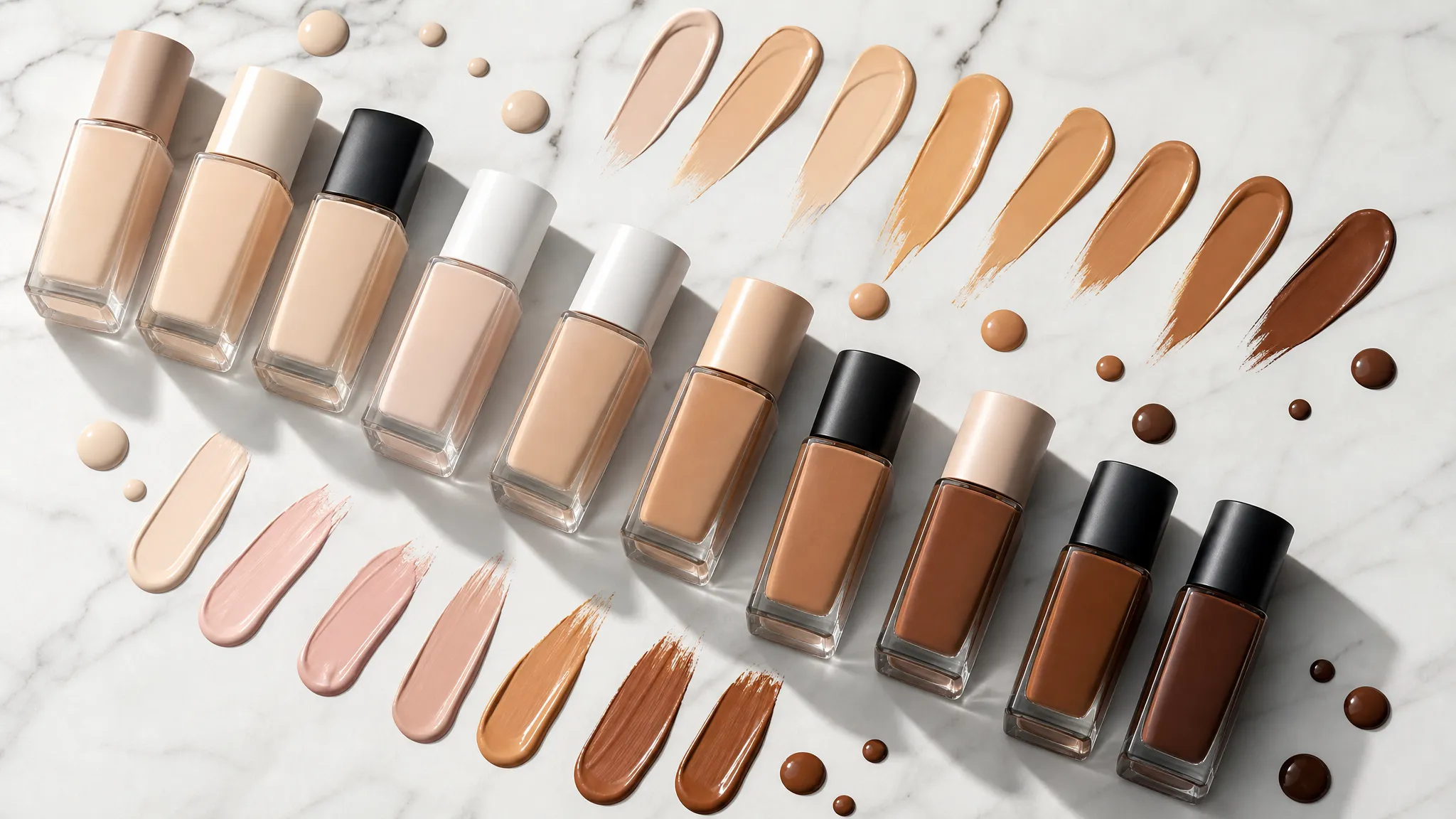
The Foundation Graveyard in My Bathroom Drawer
I have a drawer full of abandoned foundations. Seventeen bottles at last count — some barely used, a few still sealed — every single one purchased with the confidence that this time I'd finally found my match.
The sales associate would swatch it on my jawline, nod approvingly under the store's flattering lights, and send me home feeling great. Then I'd catch my reflection in natural daylight and see it: that unmistakable yellow cast, or the ashy gray undertone pulling away from my skin, or the strange pinkish mask that made me look like I was wearing foundation rather than just looking like a better version of myself.
If this sounds familiar, I have good news and bad news. The bad news: you've probably been shade-matching wrong your entire life. The good news: the fix is simpler than you think, and it has nothing to do with shade depth.
It's Not the Shade — It's the Undertone
Here's the fundamental mistake most people make: they focus exclusively on how light or dark a foundation is (the shade), while ignoring the color beneath the color (the undertone).
Shade depth is straightforward. You can tell with your eyes whether a foundation is too light or too dark. But undertone mismatch is sneaky — it creates that "something's off" feeling without being obvious about why. A foundation can be the perfect depth and still look completely wrong if the undertone doesn't match your skin.
What is undertone, exactly? It's the color that sits beneath the surface of your skin, independent of how light or dark you are. Two people can have identical shade depth — say, a medium beige — but look completely different in the same foundation because one has warm (golden/peach) undertone and the other has cool (pink/blue) undertone.
Foundation undertones fall into four categories:
- Warm: Golden, peachy, or yellow-based. These formulas look sun-kissed on warm skin and sallow on cool skin.
- Cool: Pink, red, or blue-based. These look fresh on cool skin and artificially rosy on warm skin.
- Neutral: A balanced mix. These are the most forgiving, but they're not universally flattering — they can look flat on strongly warm or cool skin.
- Olive: A green-yellow modifier that exists on top of warm or cool undertones. The rarest and most frequently mismatched category.
See your personal color palette now
Upload a photo — get your AI beauty report in 60 seconds.
Why Standard Matching Methods Fail
The Jawline Swatch Problem
Swiping foundation on your jawline tells you about shade depth, but it's terrible for undertone assessment. Your jaw receives less sunlight than your cheeks, your forehead is a different color entirely, and store lighting (usually warm LED or fluorescent) distorts undertone perception.
A 2019 study in the Journal of Cosmetic Dermatology found that 67% of consumers were wearing the wrong foundation undertone despite believing their match was correct. The main culprit: testing in artificial light.
The "Match to Your Neck" Myth
This advice assumes your face and neck share the same undertone, which often isn't true. Your neck may be lighter and show more vein color. Your face has more blood flow near the surface, adding redness. And if you've had any sun exposure at all, your facial skin has shifted warmer while your neck stayed closer to its natural state.
The Celebrity Shade Name Trap
Foundation names are marketing, not science. "Sand," "Buff," "Beige," and "Natural" mean different things at every brand. Clinique's "Neutral" leans warm. MAC's "NC" (Neutral Cool) actually runs warm. NARS "Deauville" has olive undertones that look muddy on cool skin. You cannot shop by name alone.
How to Actually Determine Your Skin's Undertone
Forget the vein test (unreliable) and the jewelry test (subjective). Here are five methods that actually work, ranked by accuracy:
1. The Bare Skin Daylight Test
Strip your skin bare — no moisturizer, no primer, no residual product. Wait 20 minutes. Stand near a north-facing window (indirect natural light, no direct sun). Hold a white piece of paper next to your cheek.
What you're looking for:
- Warm undertone: Your skin looks golden, peachy, or slightly yellow against the white paper
- Cool undertone: Your skin looks pink, rosy, or slightly blue
- Neutral undertone: Your skin doesn't pull strongly in either direction — it just looks "skin colored"
- Olive undertone: You see a faint greenish or grayish cast, especially around the mouth and under the eyes
2. The White T-Shirt Test
Wear a pure white (not cream, not ivory) t-shirt in natural light. How does it make your face look?
- If your face looks healthier and brighter → you likely have cool undertone (white has blue undertones that harmonize)
- If your face looks slightly washed out or sallow → you likely have warm undertone (try the same test with an off-white or cream shirt)
- If it looks fine either way → neutral
3. The Two-Foundation Comparison
Go to a makeup counter and ask for two samples of the SAME shade depth — one in a warm formula and one in a cool formula. Wear each on half your face for a full day in natural light. The wrong undertone becomes glaringly obvious after several hours, even if both looked "fine" during a quick swatch.
This is the single most reliable consumer test I've found. It takes patience, but it eliminates guesswork entirely.
4. The Inner Wrist Method (Improved)
The standard vein test is unreliable because vein color depends on depth, light conditions, and individual anatomy. But the inner wrist is useful for one thing: it shows your skin at its most untanned and unmodified.
Look at the overall skin tone of your inner wrist in natural light (ignore the veins). Compare it to the skin on your cheek:
- If they're similar → your face hasn't shifted much from your natural undertone
- If your cheek looks warmer/more golden → sun exposure has added warmth; your TRUE undertone is closer to your wrist
5. AI-Powered Undertone Analysis
Technology has gotten remarkably good at this. AI color analysis tools can photograph your skin in standardized conditions and isolate undertone from surface color, tan, redness, and lighting bias. I've tested several, and they consistently outperform in-store matching — particularly for tricky cases like olive undertones or neutral-leaning skin that confuses human eyes.
Tools like aicoloranalysis.io can analyze your undertone from a selfie and generate foundation shade recommendations calibrated to your specific coloring.
The Olive Undertone Problem (And Why It's So Hard to Match)
If you've always struggled to find foundation — if warm shades look too yellow and cool shades look too pink and neutral shades look weirdly gray — you might be olive.
Olive undertone affects roughly 20-25% of the global population, yet most foundation lines offer zero olive-specific shades. Instead, olive-skinned people are forced to choose between "the least bad option" from warm, cool, or neutral categories.
What makes olive different: Olive isn't warm or cool — it's a green-yellow modifier that sits on TOP of your warm or cool undertone. You can be warm-olive (golden green) or cool-olive (grayish green). This extra dimension is why standard two-axis matching (warm vs. cool × light vs. dark) always feels slightly off.
Signs you might be olive:
- Foundation oxidizes strangely on you (turns orange or grayish within hours)
- You look good in both gold AND silver jewelry, but muted versions of each
- Your skin has a subtle greenish or grayish cast, especially bare
- Earth tones (olive green, terracotta, warm brown) look incredibly natural on you
- Bright pure white makes you look sickly, but off-white looks great
Olive foundation strategy:
- Look for brands that explicitly offer olive ranges (Koh Gen Do, Danessa Myricks, RCMA, Armani)
- If your brand doesn't have olive, start with a warm shade and mix in a tiny amount of green color corrector
- Set with a yellow-green translucent powder rather than pink or colorless
- Accept that your "perfect match" might be a custom mix, not a single product
Foundation Matching by Season Type
Your personal color season gives strong clues about your foundation undertone:
Spring seasons (Light Spring, True Spring, Bright Spring): Foundation undertone: Warm. Look for golden, peachy formulas. Springs often oxidize warm, so go slightly lighter than your match looks in-store.
Summer seasons (Light Summer, True Summer, Soft Summer): Foundation undertone: Cool to neutral-cool. Look for pink or neutral formulas. Avoid anything described as "golden" or "sun-kissed."
Autumn seasons (Soft Autumn, True Autumn, Deep Autumn): Foundation undertone: Warm to warm-olive. Autumns have the richest, most golden skin tones. Look for warm, earthy formulas. Many Deep Autumns do well with olive-leaning shades.
Winter seasons (Deep Winter, True Winter, Bright Winter): Foundation undertone: Cool. Winters have the most contrast between skin and features. Look for neutral-cool to cool formulas. Avoid warm shades — they make Winter coloring look muddy.
The Oxidation Factor Nobody Warns You About
Even a perfect undertone match can fail after a few hours thanks to oxidation — the chemical reaction between your skin's oils, pH level, and the foundation's pigments.
Foundation almost always oxidizes WARMER. That means:
- Cool undertone skin: Your foundation shifts away from your natural tone, creating an increasingly visible mismatch throughout the day
- Warm undertone skin: Your foundation may become too warm, looking orange
- Olive undertone skin: Oxidation plus olive = that dreaded "muddy" look
How to test for oxidation: Apply your prospective foundation to your jawline in the morning. Take a photo in natural light immediately, then again after 4 hours. Compare. If the color has shifted noticeably, either:
- Choose a shade with slightly cooler undertone to compensate for the warm shift
- Use a silicone-based primer (creates a barrier that slows oxidation)
- Set with a color-correcting powder that pulls slightly cool
A Practical Shopping Checklist
Next time you foundation-shop, use this checklist:
Before you go:
- Know your undertone category (warm/cool/neutral/olive)
- Know your color season (this narrows options dramatically)
- Check the brand's undertone system online (every brand codes differently)
- Go with a bare, clean face — no moisturizer or SPF that could affect undertone reading
At the counter:
- Ask for TWO shades in your depth — one warm-leaning, one cool-leaning
- Swatch on your cheek (not jaw) in natural light (step outside if possible)
- Take samples home and wear each for a full day
- Check your match at noon in direct daylight AND in evening indoor light
- Photograph at the 4-hour mark to check for oxidation shift
Decision time:
- The right match should look like your skin, but better — not like a layer ON your skin
- If neither sample is right, you may need a different brand's undertone formula entirely
- If you consistently fall "between" warm and cool, explore olive or neutral-olive shades
Key Takeaways
- Shade depth is easy; undertone matching is where 67% of people go wrong. A foundation can be the perfect lightness/darkness and still look terrible if the undertone conflicts with your skin.
- The four undertone categories — warm, cool, neutral, and olive — each need different foundation formulas. Standard "neutral" is not a universal solution.
- Test in natural daylight, on your cheek, over several hours. Quick in-store swatches under artificial light are the #1 reason for foundation mismatches.
- Olive undertone is real, common, and chronically underserved by most foundation lines. If warm looks too yellow and cool looks too pink, explore olive-specific brands or custom mixing.
- Oxidation always shifts warm. Account for it by choosing a slightly cooler shade than your initial match suggests.
Finding your foundation match isn't about trying more shades — it's about understanding the dimension you've probably been ignoring. Once you crack the undertone code, that drawer of abandoned bottles becomes a thing of the past.
Related Articles
- Neutral Undertone: The Hardest Skin Tone to Diagnose (Here's How) — Why neutral undertone breaks standard tests and how to identify it
- The Best Makeup Colors for Every Color Season: A Complete Chart — Foundation, lips, eyes, and blush recommendations by season
- Olive Undertone: The Most Misunderstood Skin Tone Explained — Deep dive into olive undertone identification and styling
- Color Analysis: The Complete Guide — Everything you need to know about finding your best colors
Want to try AI color analysis yourself?
Upload one photo and get a magazine-level beauty report in 60 seconds.
Start Free Analysis