स्प्रिंग से समर पैलेट में कैसे ट्रांज़िशन करें (शुरुआत से नहीं)
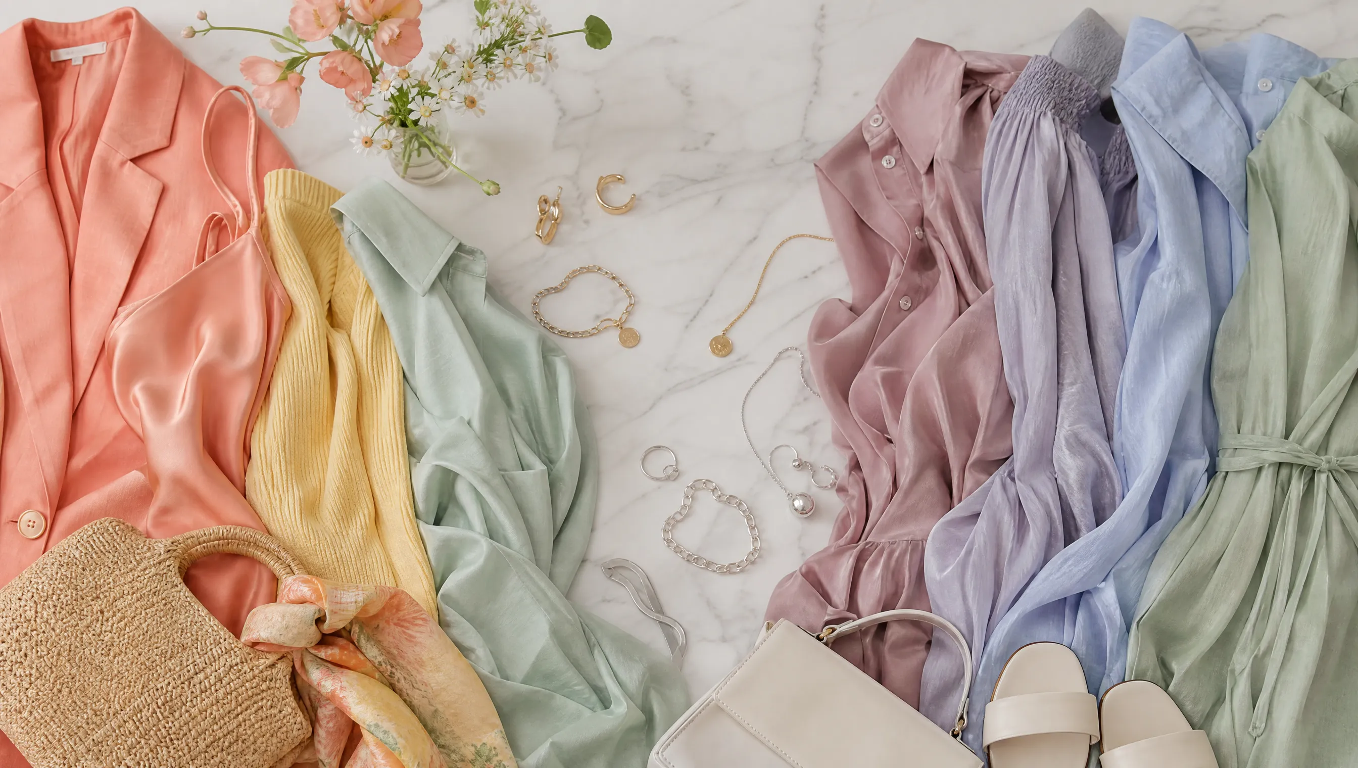
हर जून में होने वाला वॉर्डरोब क्राइसिस
हर साल मई के अंत में मैं एक ही दीवार से टकराती हूँ। मेरा क्लoset गर्म peach, coral और golden yellow pieces से भरा है — जिन्होंने पूरे Spring में मुझे glow कराया — लेकिन अचानक वे बहुत heavy, बहुत warm, बहुत ज़्यादा लगने लगते हैं। रोशनी बदल गई है। हवा अलग महसूस होती है। और April में जिन colors ने मुझे radiant बनाया, June में वही थोड़ा flushed look देने लगते हैं।
अगर आपको भी लगा है कि मौसम बदलते ही वॉर्डरोब काम करना बंद कर देता है — तो यह आपकी कल्पना नहीं है। Spring से Summer का transition सिर्फ temperature change नहीं है — यह light change है। और natural light में यह shift genuinely affect करता है कि colors आपकी skin के साथ कैसे interact करते हैं।
यह Spring wardrobe फेंककर नया खरीदने की बात नहीं है। बल्कि Spring और Summer palettes के overlap को समझने, bridge pieces identify करने, और strategic छोटे additions की बात है जो आपको transition में ले जाएँ।
Seasonal light colors को आप पर कैसे अलग दिखाता है
ज़्यादातर color analysis guides जो skip करते हैं: आपका color season calendar के साथ नहीं बदलता। True Spring January में भी True Spring है और August में भी। लेकिन आसपास की ambient light ज़रूर shift होती है — और यह बदलता है कि real life में palette colors आपकी skin पर कैसे render होते हैं।
Spring sunlight lower-angle, warmer color temperature और softer होती है। Warm, clear tones naturally flatter होते हैं। Summer sunlight higher-angle, cooler और more diffused होती है (खासकर humid climates में)। Spring की golden light में pop करने वाले colors, Summer की cooler, brighter sky के नीचे थोड़े garish लग सकते हैं।
इसीलिए कई लोग Summer में intuitively softer, cooler pieces की ओर जाते हैं, भले ही technically warm color season हो। वे light shift compensate कर रहे हैं — और यह actually smart styling है, color analysis violation नहीं।
Trick है इसे frustrated trial-and-error की बजाय intentionally करना।
अपनी पर्सनल कलर पैलेट अभी देखें
फोटो अपलोड करें — 60 सेकंड में अपनी AI ब्यूटी रिपोर्ट पाएं।
Spring-Summer Overlap Zone: दोनों seasons में काम करने वाले colors
Good news: Spring और Summer palettes opposites नहीं हैं। Middle ground में surprisingly कई colors share करते हैं — खासकर अगर bridge sub-seasons पर focus करें: Light Spring और Light Summer।
दोनों seasons में काम करने वाले colors:
- Soft coral → Spring के लिए warm enough, Summer के लिए muted enough
- Dusty rose → Spring peach का cooled-down version
- Warm lavender → Summer का signature, लेकिन warmer versions अभी भी Spring skin के साथ harmonize करते हैं
- Sage green → Spring के warm greens और Summer के cool teals के बीच
- Champagne / soft gold → warm और cool-leaning palettes दोनों के लिए neutral
- Powder blue → Light Spring का secondary blue Summer core palette से overlap करता है
- Soft aqua → Spring turquoise और Summer seafoam के बीच sweet spot
ये आपके bridge colors हैं — वे pieces जो transition में दोनों seasons की light में out of place नहीं लगकर closet space earn करते हैं।
Practical Transition Strategy (Week by Week)
June 1 को पूरा wardrobe overhaul करने की ज़रूरत नहीं। मैं shift कैसे handle करती हूँ:
Weeks 1–2: Muting शुरू करें
Spring palette रखें, लेकिन usual colors के muted versions चुनना शुरू करें। Bright coral की जगह soft coral। Clear turquoise की जगह dusty aqua। Go-to warm tones के lighter, more washed-out version चुनें।
यह subtle shift comfort zone में रखता है जब तक आँख changing light के साथ adjust हो।
Weeks 3–4: Cool Neutrals introduce करें
Warm neutrals (camel, warm beige, cream) को cool neutrals (taupe, cool gray, soft white) से replace करें। Cooler bases remaining Spring accent colors को more current feel देते हैं बिना पूरी तरह बदले।
Peach blouse warm khaki pants पर = peak Spring। Same peach blouse cool gray trousers पर = early Summer। Same top, completely different seasonal energy।
Weeks 5–6: Summer Accents add करें
अब true Summer tones accent pieces के रूप में introduce करें: dusty rose scarf, lavender bag, powder blue earrings। Small additions outfits की overall color story को Summer की ओर shift करते हैं बिना core wardrobe replace किए।
Ongoing: Makeup lead करने दें
Seasonal shift signal करने का सबसे fast तरीका makeup है। Warm peachy blush की जगह cool pink। Golden highlighter की जगह silver-pearl। Warm nude lip की जगह mauve। Five minutes लगते हैं और पूरा Spring outfit summer-appropriate feel कर सकता है।
Crossover Capsule: दोनों seasons को जोड़ने वाले 10 pieces
अगर Spring और Summer wardrobes के बीच gap bridge करने के लिए सिर्फ 10 items खरीद सकें, तो मेरी recommendation:
| # | Piece | Color | Why It Works |
|---|---|---|---|
| 1 | Silk camisole | Dusty rose | Spring के लिए warm enough, Summer के लिए cool enough |
| 2 | Linen blazer | Soft sage | Nature का सबसे season-neutral color |
| 3 | Cotton t-shirt | Powder blue | Light Spring और Light Summer दोनों claim करते हैं |
| 4 | Wide-leg trousers | Cool taupe | Summer lean करता neutral, Spring से clash नहीं |
| 5 | Midi skirt | Champagne | Warm और cool metallic territory bridge |
| 6 | Knit cardigan | Warm lavender | Spring skin के लिए enough warmth वाला Summer color |
| 7 | Denim jacket | Light wash | Ultimate season-neutral layering piece |
| 8 | Silk scarf | Soft coral | Transition accent piece |
| 9 | Canvas sneakers | Off-white | हर bridge color के साथ works |
| 10 | Crossbody bag | Soft aqua | दोनों palettes span करने वाला statement piece |
Key है muted middle में colors चुनना — Spring का brightest version नहीं, Summer का coolest version नहीं, बल्कि soft zone जहाँ वे meet करते हैं।
Palette Transition में Common Mistakes
Mistake 1: बहुत जल्दी बहुत Cool जाना
अगर Spring type हैं, straight icy lavender या steel blue में jump wash out कर देगा season की परवाह किए बिना। Transition gradual हो — muted warm → neutral → muted cool। Straight cool end पर jump करेंगे तो लगेगा किसी और के colors पहन रहे हैं।
Mistake 2: Contrast Level ignore करना
Spring palettes medium-high contrast (warm + clear) tend करते हैं। Summer palettes lower contrast (cool + muted)। सिर्फ hue swap करें contrast level नहीं, outfit अभी भी off feel करेगा। Summer की ओर बढ़ते समय overall contrast lower करें — softer pairings, less dramatic light-dark combinations।
Mistake 3: Metal Tones भूल जाना
Jewelry भी transition करनी चाहिए। Spring warm gold favor करता है। Summer silver या rose gold। Transition में rose gold best friend — warmth है और cool pink undertones दोनों seasons bridge करते हैं।
Mistake 4: एक बार में सब कुछ बदल देना
Stylish seasonal transitions वे हैं जिन्हें कोई notice नहीं करता। Overnight पूरी palette change jarring feel करेगा — आपको और आसपास वालों को। 4–6 weeks में small, incremental shifts natural लगते हैं और assess करने का time मिलता है कि actually क्या works।
अगर आप seasons के बीच हैं? (Light Spring / Light Summer Question)
कुछ लोग color analysis से discover करते हैं कि वे Spring-Summer border पर हैं। Light Spring और Light Summer Spring-Summer divide पर closest sub-seasons हैं — lightness और softness share, mainly undertone warmth में differ।
Light Spring हैं तो warm months में ज़्यादातर Light Summer colors comfortably wear कर सकते हैं। Light Summer हैं तो cooler months में कई Light Spring tones work करेंगे। Essentially built-in transition palette है।
Border types के लिए challenge anchor colors find करना — 2–3 shades year-round work करें light changes की परवाह किए बिना। Light Spring के लिए usually soft peach और warm ivory। Light Summer के लिए dusty rose और soft blue-gray।
Sure नहीं कि border के किस side fall करते हैं, AI color analysis tools clarify कर सकते हैं। Modern apps skin undertone, contrast level और chroma analyze कर exact sub-season determine करते हैं — और कई neighboring seasons overlap colors specifically show करते हैं, seamless transitions के लिए exactly वही information चाहिए।
Spring और Summer से आगे: क्या यह other transitions पर apply होता है?
Absolutely। Same principles हर seasonal boundary पर:
- Summer → Autumn: Cool muted से warm muted। Dusty rose → terracotta। Lavender → plum। Sage → olive।
- Autumn → Winter: Warm muted से cool clear। Olive → forest green। Rust → burgundy। Camel → espresso।
- Winter → Spring: Cool clear से warm clear। Icy pink → coral। Royal blue → turquoise। Black → navy।
हर transition same pattern: mute first, undertone shift, destination palette से accent colors add।
Key Takeaways
- Color season नहीं बदलता, ambient light बदलता है — seasonal light shifts के लिए palette adapt करना smart styling है
- Spring-Summer overlap zone में soft coral, dusty rose, sage, warm lavender, powder blue शामिल हैं
- 4–6 weeks gradually transition: पहले mute, cool neutrals add, फिर Summer accents
- Makeup seasonal read wardrobe से faster shift कर सकता है
- Border type (Light Spring / Light Summer) हो तो natural advantage — lean into it
- AI color analysis exact sub-season identify कर neighboring seasons bridge colors show कर सकता है
Best-dressed लोग seasonal shift से fight नहीं करते — ride करते हैं। Secret: सोच से कहीं कम new pieces चाहिए। ज़्यादातर transition how combine करते हैं owned items, not what buy।
संबंधित लेख
- स्प्रिंग रंग पैलेट समझाए गए: Bright Spring vs True Spring vs Light Spring — तीनों Spring sub-seasons का complete breakdown
- समर कलर पैलेट डिकोडेड: Cool Summer vs True Summer vs Soft Summer — Summer sub-seasons के बारे में everything you need to know
- अपने कलर सीज़न के अनुसार कैप्सूल वॉर्डरोब कैसे बनाएं (स्टेप-बाय-स्टेप गाइड) — Seasonal palette के around versatile wardrobe build करें
- कलर एनालिसिस: संपूर्ण गाइड — अपने best colors find करने के लिए जो कुछ भी जानना है
खुद AI कलर एनालिसिस आज़माना चाहती हैं?
एक फोटो अपलोड करें और 60 सेकंड में मैगज़ीन-स्तर की ब्यूटी रिपोर्ट पाएं।
मुफ्त एनालिसिस शुरू करें