The Science Behind Personal Color Analysis: How It Actually Works
Why Do Some Colors Make You Look Amazing — and Others Don't?
You've probably experienced it. You try on a coral top and your skin looks radiant, your eyes pop, and someone asks if you've been on vacation. Then you throw on an olive green sweater and suddenly you look exhausted — even though you slept eight hours.
This isn't in your head. There's actual science behind it, and once you understand the mechanics, the whole world of "what colors suit me" stops being guesswork and starts making sense.
I spent months digging into the physics, biology, and perceptual science behind personal color analysis. Here's what I found — and why this century-old practice is backed by more hard science than most people realize.
It All Starts with Light: The Physics of Color Perception
To understand why colors interact with your appearance, you need to start with how we see color in the first place.
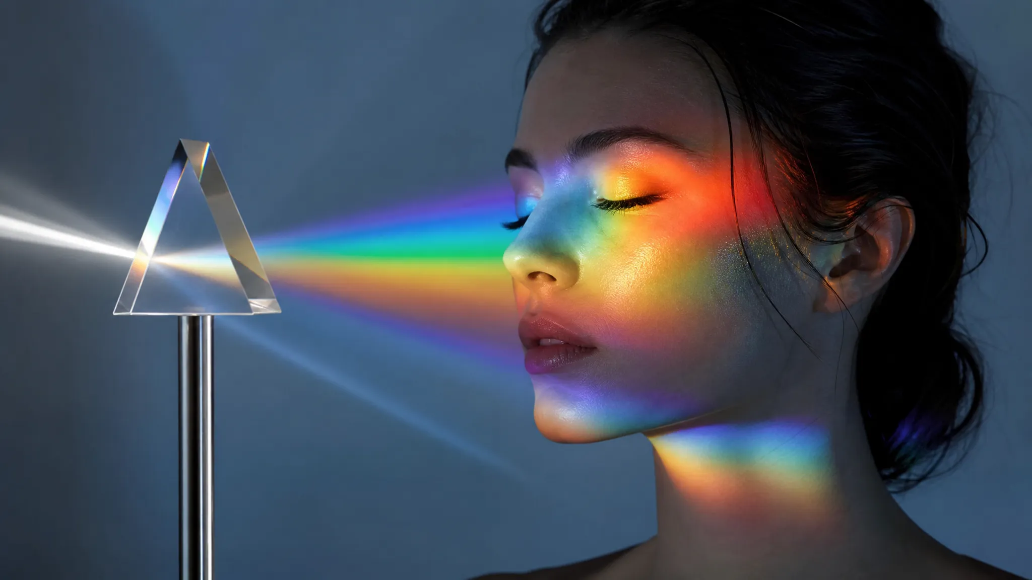
Color isn't a property of objects — it's a property of light. When white light (which contains all visible wavelengths) hits a surface, some wavelengths are absorbed and others are reflected. The reflected wavelengths are what your eyes interpret as color.
Your skin works the same way. When light hits your face, certain wavelengths are absorbed by the pigments in your skin, and others bounce back to the observer. The specific mix of reflected wavelengths is what gives your skin its unique appearance — its "color."
Here's where it gets interesting for color analysis: when you wear a colored garment near your face, the light reflected from that garment mixes with the light reflected from your skin. This is called simultaneous contrast, and it's the fundamental physics behind why some colors flatter you and others don't.
A blue-based red top reflects cool-toned light onto your face. If your skin also reflects predominantly cool wavelengths (pink/blue undertones), the two light sources harmonize. Your skin looks even-toned and luminous. But if your skin reflects warm wavelengths (golden/peach undertones), that same blue-red light creates a visual clash — your skin can look grey or sallow by comparison.
This isn't subjective. It's the physics of light mixing, and it's measurable.
See your personal color palette now
Upload a photo — get your AI beauty report in 60 seconds.
The Biology: What Actually Creates Your Coloring
Your unique coloring — the combination of your skin, hair, and eye color — is determined by a surprisingly small set of biological pigments. Understanding these helps explain why color analysis works so consistently.
Melanin: The Master Pigment
Melanin is the primary pigment in human skin, hair, and eyes. But here's what most people don't know: there are two types of melanin, and their ratio determines your undertone.
- Eumelanin produces brown-to-black tones. It's responsible for deep, cool-leaning coloring.
- Pheomelanin produces red-to-yellow tones. It's responsible for warm, golden coloring — and is also why redheads are redheads.
Everyone has both types. Your unique ratio of eumelanin to pheomelanin is what creates your specific undertone. People with a higher eumelanin ratio tend to have cool undertones (pink, blue, or neutral-cool), while those with more pheomelanin lean warm (golden, peach, or yellow).
This ratio is genetically fixed. It doesn't change with tanning, aging, or skincare. A tan adds more melanin overall, which changes your depth (how light or dark your skin appears), but it doesn't shift the fundamental ratio between the two types. This is why your undertone stays the same throughout your life — and why a color analysis done at 25 is still valid at 55.
Hemoglobin: The Hidden Player
Beneath your melanin layer, hemoglobin in your blood vessels adds another layer of color. Oxygenated hemoglobin gives skin a pinkish-red hue, while deoxygenated hemoglobin leans blue-purple.
In people with lighter skin, hemoglobin's contribution is more visible — it's why veins appear blue or green depending on your depth and undertone. In deeper skin tones, melanin is more dominant, but hemoglobin still influences the overall warmth or coolness of the skin.
Vein test explained: The popular "look at your wrist veins" undertone test actually works because of the interaction between melanin depth and hemoglobin color. Blue/purple veins suggest cool undertones (less warm pheomelanin allowing the blue hemoglobin to show through), while green veins suggest warm undertones (yellow pheomelanin mixing with blue hemoglobin to appear green).
Carotenoids: The Yellow Factor
A third pigment — carotenoids from dietary fruits and vegetables — adds a subtle yellow-orange tint to skin. This is particularly relevant for understanding olive undertones, where a greenish-grey cast appears from the unique interaction of carotenoids with eumelanin.
Olive undertones are the most misunderstood in color analysis precisely because this third pigment creates a "neutral-ish" appearance that's hard to categorize as simply warm or cool.
The 12-Season System: Where Science Meets Practice
The modern 12-season color analysis system organizes human coloring along three scientifically measurable dimensions:
1. Hue (Warm vs. Cool)
This maps directly to your eumelanin-to-pheomelanin ratio. It's the most important dimension in color analysis and the one that determines whether warm or cool colors will harmonize with your natural coloring.
Measurably: Warm skin reflects more light in the 570-700nm wavelength range (yellow-orange-red), while cool skin reflects more in the 450-500nm range (blue-violet).
2. Value (Light vs. Deep)
This corresponds to your overall melanin concentration. High melanin = deep coloring. Low melanin = light coloring. This dimension determines whether you need deep, saturated colors or lighter, more delicate tones to match your natural contrast level.
3. Chroma (Bright/Clear vs. Muted/Soft)
This is perhaps the most interesting dimension scientifically. Chroma describes how saturated and clear your coloring appears. High-chroma individuals have a vivid, high-contrast look (think bright eyes against contrasting skin). Low-chroma individuals have a softer, more blended appearance.
Chroma is determined by a complex interaction of melanin distribution, skin translucency, and contrast between features. It's the hardest dimension to assess by eye — and it's the one where AI analysis has the biggest advantage over human judgment.
Each of the 12 seasons represents a specific combination of these three dimensions:
| Season | Hue | Dominant Trait | Example |
|---|---|---|---|
| Bright Spring | Warm | High chroma | Clear, warm, vivid coloring |
| Light Spring | Warm | Light value | Delicate, warm, light coloring |
| Warm Spring | Warm | Strong warmth | Unmistakably golden coloring |
| Bright Winter | Cool | High chroma | Vivid, cool, high-contrast |
| Dark Winter | Cool | Deep value | Rich, deep, cool-leaning |
| True Winter | Cool | Strong coolness | Classic cool and icy |
| Light Summer | Cool | Light value | Soft, cool, delicate |
| Soft Summer | Cool | Low chroma | Muted, cool, gentle |
| True Summer | Cool | Moderate cool | Balanced cool tones |
| Warm Autumn | Warm | Strong warmth | Rich golden warmth |
| Soft Autumn | Warm | Low chroma | Muted, warm, earthy |
| Dark Autumn | Warm | Deep value | Deep, warm, rich |
Simultaneous Contrast: The Core Mechanism
Now that you understand the biology of coloring and the physics of light, let's connect them through the perceptual phenomenon that makes color analysis actually work: simultaneous contrast.
Simultaneous contrast was first described by French chemist Michel Eugène Chevreul in 1839. He noticed that the apparent color of an object changes depending on what colors surround it. His work at the Gobelins tapestry factory led him to realize that complaints about dye quality were actually about color placement — yarns looked different depending on their neighboring colors.
How this applies to you: When you wear a color near your face, it creates a "surround" that alters how your skin color is perceived. Specifically:
- Harmonious colors (those sharing your undertone) make your skin appear smooth, even, and luminous. The reflected light reinforces your natural coloring.
- Disharmonious colors (those opposing your undertone) create a visual tension. Your skin can appear sallow, grey, ruddy, or uneven because the reflected light clashes with your natural pigments.
This isn't a subtle effect. Research in color science has shown that simultaneous contrast can shift perceived color by as much as 20-30% on perceptual color scales. That's the difference between "you look amazing" and "are you feeling okay?"
Why Traditional Color Analysis Is Hard (And Where AI Comes In)
Traditional color analysis — where a consultant holds fabric drapes next to your face — is based on solid science. But it has some significant practical limitations:
Human color perception is unreliable. Our eyes adapt to surrounding colors (chromatic adaptation), are influenced by lighting conditions, and are subject to fatigue. Two consultants can disagree on the same person's season because their eyes are literally perceiving the colors differently.
Lighting matters enormously. Color analysis should ideally be done in calibrated daylight (around 5500K color temperature). But most consultations happen in rooms with mixed lighting — warm overhead bulbs plus window light — which shifts how both the drapes and the skin appear.
The three dimensions interact. A person might clearly be cool-toned (hue), but are they light or deep? Bright or muted? Each subsequent dimension narrows the 12-season result, and getting any one wrong cascades through the whole analysis.
This is where computational approaches offer a genuine advantage. A camera sensor, unlike the human eye, measures actual light wavelengths consistently. AI-powered color analysis can extract precise color values from skin, hair, and eye pixels, map them onto the three-dimensional color space, and determine which season shows the strongest mathematical harmony — without the variability of human perception or ambient lighting compensation.
That's not to say technology is perfect. Photo quality, lighting in the selfie, and camera white balance all introduce variables. But the core advantage — objective, repeatable measurement of color values — addresses the biggest weakness of traditional draping.
The Practical Takeaway: Why This Science Matters for Your Wardrobe
Understanding the science doesn't just satisfy intellectual curiosity — it gives you practical tools:
1. Your undertone is biological, not cosmetic. No amount of foundation or self-tanning will change whether warm or cool colors harmonize with your natural coloring. Work with your biology, not against it.
2. Depth and chroma matter as much as warmth/coolness. A warm-toned person who wears colors that are the right temperature but wrong depth will still look "off." Getting all three dimensions right is what creates that "wow, you look great" effect.
3. The science applies universally. Color analysis works across all ethnicities and skin depths because the underlying principles — melanin ratios, light reflection, simultaneous contrast — are universal human biology. A Deep Winter person with very dark skin and a Deep Winter person with medium skin will both look their best in the same color family.
4. It's not about rules — it's about physics. When someone says "you can't wear yellow," what they actually mean is "yellow reflects warm light that clashes with your cool-dominant melanin ratio." Understanding this lets you find the right version of any color. Cool-toned people can wear lemon yellow (which is cool-leaning) even if golden mustard doesn't work.
Key Takeaways
- Color flattery is physics: It's based on how light reflected from clothing interacts with light reflected from your skin — a measurable phenomenon called simultaneous contrast.
- Your coloring is set by biology: The ratio of eumelanin to pheomelanin in your skin determines your undertone, and it doesn't change over your lifetime.
- The 12-season system maps to three measurable dimensions: hue (warm/cool), value (light/deep), and chroma (bright/muted) — making personal color analysis more structured than it might seem.
- AI analysis addresses the biggest weaknesses of traditional draping: inconsistent lighting, subjective human perception, and the difficulty of assessing chroma.
The next time someone tells you a color "isn't your shade," remember — there's a century of color science, biology, and perceptual psychology behind that instinct. Personal color analysis isn't fashion opinion. It's applied physics.
Related Articles
- Color Analysis: The Complete Guide — Everything you need to know about finding your best colors
- Personal Color Analysis: All 12 Types Explained — Understand the full 12-season system
- How to Determine Your Skin Undertone — Apply the science with practical undertone tests
- Why Online Color Analysis Quizzes Get It Wrong — Understanding the limitations of self-assessment
Want to try AI color analysis yourself?
Upload one photo and get a magazine-level beauty report in 60 seconds.
Start Free Analysis