अपने कलर सीज़न के लिए ऑनलाइन शॉपिंग कैसे करें (गलती किए बिना)
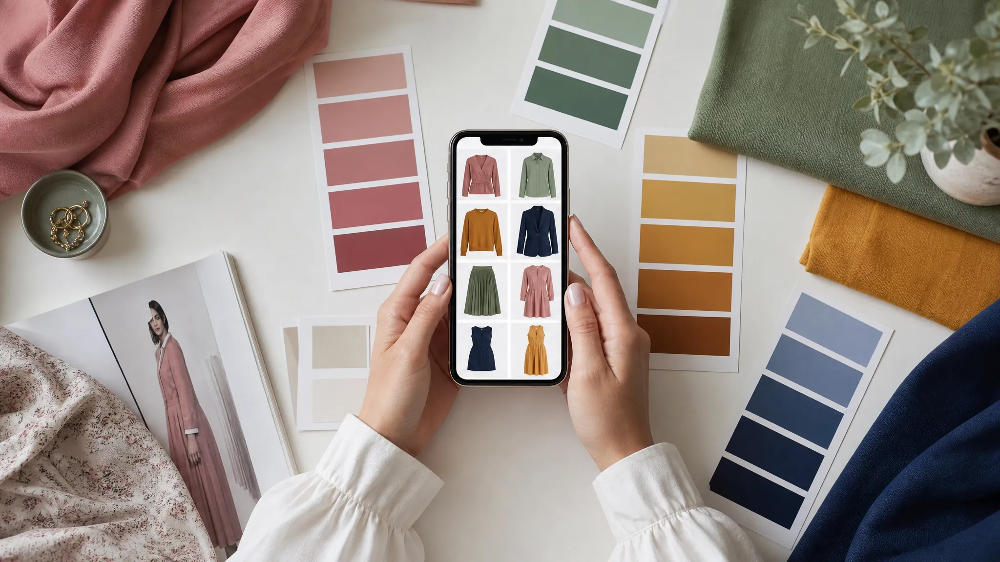
ऑनलाइन शॉपिंग का रंग-संबंधी मसला जिस पर कोई बात नहीं करता
जब मुझे आखिरकार अपना कलर सीज़न पता चला, मैं बहुत उत्साहित थी। Soft Summer — muted, cool-toned, मध्यम गहराई वाले रंग। dusty rose, sage, slate blue, cool taupe। मैंने तुरंत लैपटॉप खोला, पसंदीदा स्टोर खोले और कार्ट में चीज़ें डालनी शुरू कर दीं।
तीन दिन और एक डिलीवरी बाद, मैं कपड़ों के ढेर को देख रही थी जो ऑर्डर किए गए रंगों से बिल्कुल मेल नहीं खाते थे। «dusty mauve» टॉप ज़बरदस्ती गुलाबी था। «sage green» ट्राउज़र नियॉन ऑलिव। और «cool gray» ब्लेज़र में साफ़ warm, पीला cast था — ऐसा लग रहा था जैसे एक हफ़्ते से नींद नहीं ली।
जाना-पहचाना लगता है? अगर आपने कभी अपने कलर सीज़न के हिसाब से ऑनलाइन शॉपिंग की है, तो यह दर्द आप जानती हैं। स्क्रीन के रंग हैंगर पर मौजूद रंग नहीं हैं — और सीज़न जानना काम नहीं आता अगर हर मॉनिटर अलग झूठ बोलता है।
मैंने दो साल ऑनलाइन कलर शॉपिंग की ऐसी सिस्टम पर काम किया है जो वास्तव में काम करती है। बिना कपड़ा छुए सही रंग खरीदने के बारे में मैंने जो कुछ सीखा, वह यहाँ है।
ऑनलाइन रंग इतने अविश्वसनीय क्यों हैं
समस्या ठीक करने से पहले, यह समझना मदद करता है कि ऑनलाइन रंग अक्सर गलत क्यों दिखते हैं। सिर्फ़ खराब फ़ोटोग्राफी नहीं — असली कपड़े और स्क्रीन के बीच कम से कम पाँच परतें искажения की हैं।
1. प्रोडक्ट फ़ोटोग्राफी की लाइटिंग
ज़्यादातर e-commerce स्टूडियो strobe लाइट और softbox का मिश्रण इस्तेमाल करते हैं। इन लाइट्स का color temperature स्टूडियो से स्टूडियो और शॉट से शॉट तक बदलता है। 4000K tungsten-balanced लाइट में खींचा गया कपड़ा, 6500K daylight-balanced strobes में खींचे गए उसी आइटम से warm दिखेगा।
fast-fashion ब्रांड यहाँ सबसे बुरे हैं। दिन में सैकड़ों आइटम minimal color correction के साथ फ़ोटो खींचते हैं, इसलिए एक ही «navy» एक लिस्टिंग में royal blue और दूसरी में लगभग black दिख सकता है।
2. मॉनिटर कैलिब्रेशन
आपकी स्क्रीन का अपना color profile है। warm कमरे में True Tone वाला iPhone सब कुछ warm की ओर shift करता है। Night Shift वाला MacBook amber जोड़ता है। सस्ता office monitor blues को crush और reds को boost कर सकता है। एक ही प्रोडक्ट पेज पर दो लोग meaningfully अलग रंग देखते हैं।
3. इमेज कंप्रेशन
JPEG compression — जो लगभग हर ऑनलाइन स्टोर इस्तेमाल करता है — file size कम करने के लिए subtle color gradations का बलिदान करता है। muted रंग सबसे ज़्यादा प्रभावित होते हैं। Soft Autumn olive और Soft Summer sage व्यक्तिगत रूप से अलग हो सकते हैं, लेकिन compression के बाद identical दिखते हैं।
4. बैकग्राउंड का प्रभाव
बैकग्राउंड का रंग, मॉडल का skin tone और फ़ोटो की styling भी आपकी perception को प्रभावित करती है। warm-toned मॉडल पर beige backdrop के सामने dusty rose blouse, cool-toned मॉडल पर white के सामने उसी blouse से warm दिखती है। दिमाग surrounding context के आधार पर color perception adjust करता है — यह simultaneous contrast नाम की well-documented घटना है।
5. नाम और रंग का mismatch
फ़ैशन ब्रांड रंगों के नाम marketing के लिए रखते हैं, accuracy के लिए नहीं। Zara, H&M और Nordstrom में «Dusty Rose» तीन बिल्कुल अलग shades हैं। «Sage» true sage (cool, muted green) से लेकर honestly «lime» कहलाने वाले तक फैला होता है। सिर्फ़ color names पर भरोसा नहीं कर सकते।
अपनी पर्सनल कलर पैलेट अभी देखें
फोटो अपलोड करें — 60 सेकंड में अपनी AI ब्यूटी रिपोर्ट पाएं।
अपनी पैलेट में ऑनलाइन शॉपिंग की 7-चरण प्रणाली
यह practical framework है जो मैं हर ऑनलाइन शॉपिंग में इस्तेमाल करती हूँ। special equipment नहीं चाहिए — बस कुछ आदतें जो return pile को काफ़ी कम कर देती हैं।
चरण 1: भौतिक कलर रेफ़रेंस बनाएँ
यह सबसे ज़्यादा प्रभावशाली कदम है। अपने सीज़न के रंगों का physical set रखें — fabric swatches, hardware store के paint chips, या printed color cards — और उन्हें computer के पास रखें।
जब ऑनलाइन कुछ पसंद आए, physical swatch को screen के बगल में रखें। आप screen-to-swatch directly compare नहीं कर रहे (अलग light sources में impossible)। आप check कर रहे हैं कि on-screen color आपकी palette की same family में आता है या नहीं। अगर screen पर «dusty mauve» आपके Soft Summer set के किसी भी swatch से noticeably warm या bright दिखे, तो warning sign है।
Swatches कहाँ से लें:
- Hardware store paint chips — free और surprisingly useful। अपने सीज़न के muted, medium-depth range से chips लें
- Fabric stores — key palette colors में छोटे fabric cuts खरीदें (कुल $5 से कम)
- Printed palette cards — कई color analysis professionals accurate Pantone-referenced colors वाली cards बेचते हैं
चरण 2: कई प्रोडक्ट इमेज देखें
सिर्फ़ hero image पर भरोसा न करें। हर available photo देखें:
- Flat lay shots (white background पर garment) आमतौर पर सबसे color-accurate — controlled lighting, model skin tone का प्रभाव नहीं
- Detail/close-up shots fabric texture और folds/shadows में color behavior दिखाते हैं
- Model shots color का skin के साथ interaction दिखाते हैं, लेकिन model undertone आपकी perception प्रभावित करता है
- Customer review photos सोना हैं। real people, real lighting, unedited colors। अक्सर actual garment का सबसे accurate representation
चरण 3: fabric composition पढ़ें
Fabric type color appearance बदलता है — और यह जानकारी ऑनलाइन हमेशा listed होती है।
- Cotton dye evenly absorb करता है और colors accurately दिखाता है। जो देखते हैं लगभग वही मिलता है।
- Polyester/synthetic light differently reflect करता है, colors natural light से slightly brighter और saturated दिखते हैं
- Silk natural sheen किसी भी color में warmth जोड़ता है। cotton gray की तुलना में «cool gray» silk warm दिखेगा
- Wool light absorb करता है, colors photographed से deeper और muted दिखते हैं
- Linen natural warmth और texture colors को slightly warm side की ओर shift करते हैं
अगर cool season (Summer या Winter) हैं, silk और linen से सावधान रहें — वे colors को naturally warm करते हैं। warm season (Spring या Autumn) हैं, polyester की artificial brightness muted colors को range से बाहर push कर सकती है।
चरण 4: brand के size/color review filter का इस्तेमाल करें
ज़्यादातर major retailers reviews को purchased color से filter करने देते हैं। यह incredibly valuable है:
- «color» या «shade» mention करने वाली reviews खोजें — shoppers अक्सर color accuracy पर comment करते हैं
- «more purple in person» या «runs warmer than pictured» जैसे phrases देखें — free, crowd-sourced color correction
- अपना coloring mention करने वाले reviewers पर ध्यान दें («as a warm-toned person, this looked...») — उनका experience आपका predict कर सकता है
चरण 5: retailers के बीच cross-reference करें
कई brands multiple retailers के ज़रिए बेचते हैं और हर retailer independently photograph करता है। exact same item brand site, department store और marketplace पर खोजें। अगर तीनों में color consistent दिखे, confidence बढ़ती है। wildly vary करे, actual color शायद बीच में है।
चरण 6: «worst case» test लगाएँ
buy click करने से पहले पूछें: «अगर यह color screen से एक shade warm / cool / bright / muted हो, तो क्या मेरे सीज़न के लिए अभी भी काम करेगा?»
यहाँ अपने सीज़न की boundaries समझना matter करता है। कुछ seasons ज़्यादा forgiving हैं:
- Soft seasons (Soft Summer, Soft Autumn) — key quality mutedness है। जब तक color too bright या saturated नहीं, temperature पर flexibility है
- True/Pure seasons (True Spring, True Summer, True Autumn, True Winter) — temperature critical है लेकिन depth और chroma पर flexibility है
- Bright seasons (Bright Spring, Bright Winter) — saturation आपका friend है। muted की बजाय brighter की ओर err करें
- Light seasons (Light Spring, Light Summer) — depth key constraint है। undertone सही हो तब भी too dark avoid करें
- Deep seasons (Deep Autumn, Deep Winter) — opposite rule। temperature range में भी pastels avoid करें
चरण 7: return window में master बनें
perfect technique के साथ भी online color shopping में failure rate है। returns को strategy में शामिल करें:
- color-sensitive purchases के लिए सिर्फ़ free returns वाले stores से खरीदें
- दो shades order करें जब available — warm और cool version, या light और dark — और गलत वाला return करें। return cost हमेशा unworn garment से कम है
- natural daylight में window के पास try on करें। bathroom lighting या night में colors evaluate न करें। 10 AM–2 PM daylight सबसे color-neutral है
- garment को face के सामने white sheet of paper के साथ रखें — neutral reference undertone warm या cool detect करने में मदद करता है
डिजिटल कलर मैचिंग चीट शीट
common online color names और हर season type के लिए वे वास्तव में क्या mean करते हैं — quick-reference table:
| Online Color Name | Usually Suits | Often Disappoints |
|---|---|---|
| «Dusty Rose» | Soft Summer, Light Summer | Deep seasons (too pale) |
| «Burgundy» | Deep Autumn, Deep Winter | Light seasons (too dark) |
| «Sage» | Soft Autumn, Soft Summer (if truly muted) | Bright seasons (too dull) |
| «Navy» | Almost everyone | Rarely disappointing — green-navy vs blue-navy check करें |
| «Cream» | Warm seasons (Spring, Autumn) | Cool seasons (yellow base clashes) |
| «Ivory» | Most seasons | Deep Autumn (not enough contrast) |
| «Blush» | Light Spring, Light Summer | Deep seasons (too washed out) |
| «Olive» | Warm seasons, Soft Autumn | Cool-dominant seasons |
| «Charcoal» | Cool seasons, Deep seasons | Light Spring (too heavy) |
| «Terracotta» | Warm Autumn, Deep Autumn | Cool Summer, Cool Winter |
जब technology वास्तव में मदद करती है
यहाँ बात interesting हो जाती है। traditional color matching में आपको human colorimeter बनना पड़ता था — screens, fabric और lighting distortions के through undertones detect करना सीखना। real skill है, लेकिन time लगता है।
Modern AI color analysis tools इस process को shortcut कर सकते हैं। guess करने की बजाय कि «dusty mauve» Soft Summer palette के लिए काम करेगा या नहीं, tools use करें जो actual color values analyze करके season characteristics से compare करते हैं।
उदाहरण के लिए, aicoloranalysis.io outfit color analysis offer करता है जो evaluate करता है कि specific clothing colors आपके skin tone के साथ harmonize करते हैं या नहीं। item पहनकर photo upload करें — color natural coloring enhance कर रहा है या clash कर रहा है, बताता है। stylist office में «draping test» जैसा, लेकिन living room से accessible।
यह खुद colors पढ़ना सीखने की जगह नहीं लेता — लेकिन useful verification tool है, खासकर जब eye develop हो रही हो।
तीन brands जो online color सही दिखाते हैं (और दूसरे कैसे पहचानें)
सालों की online shopping में मैंने देखा कि कुछ brands consistently accurate color representation में better हैं। वे क्या differently करते हैं:
Accurate brands क्या करते हैं:
- plain white या light gray background पर calibrated lighting से photograph
- diverse skin tones वाले models पर garment दिखाना
- color accuracy disclaimers और detailed descriptions («cool-toned dusty pink with gray undertones»)
- styling या filters के बिना fabric-only close-ups
- हर color के लिए exact Pantone या similar reference list करना
Inaccurate color के red flags:
- product photos पर heavy Instagram-style filters
- प्रति color सिर्फ़ एक image
- vague या purely aspirational color names («Midnight Dream», «Autumn Whisper»)
- customer photos या reviews नहीं
- extremely bright या oversaturated product photography
मुख्य बातें
- Online colors lighting, monitor calibration, compression, backgrounds और creative color naming से distorted होते हैं — screen से reality तक 20–30% color variation expect करें
- Screen के पास physical color swatches online shopping accuracy के लिए single best investment हैं
- true color judge करने में customer review photos professional product shots से ज़्यादा reliable हैं
- Fabric composition color appearance बदलता है — cotton सबसे reliable, silk warmth जोड़ता है, polyester brightness जोड़ता है
- «worst case» scenarios evaluate करने से पहले अपने सीज़न की boundaries (कौन सी quality सबसे matter करती है) समझें
- Free returns color-shopping strategy हैं, convenience नहीं — strategically order करें और बिना guilt return करें
मैं जिन best online shoppers को जानती हूँ, उनकी perfect color vision नहीं — systems हैं। अपनी बनाएँ, और delivery box आने के moment से डरना बंद कर देंगी।
संबंधित लेख
- अपने कलर सीज़न के अनुसार कैप्सूल वॉर्डरोब कैसे बनाएं (स्टेप-बाय-स्टेप गाइड) — अपनी पैलेट के भीतर versatile wardrobe बनाएं
- वार्म अंडरटोन के लिए सर्वोत्तम रंग: आपकी संपूर्ण स्टाइल गाइड (2026) — warm-toned shoppers के लिए color recommendations
- Soft Autumn vs Soft Summer: सबसे ज़्यादा भ्रमित करने वाले कलर सीज़न — इन similar seasons में अंतर करें
- कलर एनालिसिस: संपूर्ण गाइड — अपने best colors खोजने के लिए जो कुछ भी जानना है
खुद AI कलर एनालिसिस आज़माना चाहती हैं?
एक फोटो अपलोड करें और 60 सेकंड में मैगज़ीन-स्तर की ब्यूटी रिपोर्ट पाएं।
मुफ्त एनालिसिस शुरू करें